JAQUBES LEMANS

Al-Wazeer

TPF Noob!
Joined
Dec 25, 2008
Messages
1,174
Reaction score
0
Location
Bahrain (somewhere in mid east)
Can others edit my Photos
Photos OK to edit
3894135868_b06918d55e.jpg

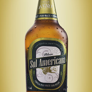
Second try in Product photography, trying different way for lighting

Used two lamplights and a flash, all diffused by the tent.

tell me what you think?
 
So I think the watch itself is fine however the background is a bit overpowering. Staring at it I lose focus from the watch and in product photography that's something you don't want to do. Unless offcourse you want to steer your viewer to a logo or some type of other sublimanal aspect of the photo trying to convey something. You want to sell this watch and you want you viewers to stare at this beautiful product that your photographing and tell them "buy me!"

So there's so much ways to edit it according to those guidelines but what I had imagined since the watch is on the dark side is to have a glow and yet not an overpowering white background. I just darkened it just beyond the perimeter of the watch to give a glow and I also increased the saturation. That's the beauty of product photography, you can increase saturation without worrying about skin tones. This is how I would wan't to see it if I was your editor ;)

3899187362_5089ca36ed_o.jpg
Wow, nice editing, and thanks for the advices camz! Really appreciate your helpful comment!
 
I love the edit by Camz...it's really pulled the product away from the background.

You've definitely got a good starting point with the original image, I love the slightly weathered look of the dials around the clock face, the slightly over saturated look really emphasises that.

Good work.

Timmy
 
The tinted look isn't doing anything for me even with the edit.
 
I love the edit by Camz...it's really pulled the product away from the background.

You've definitely got a good starting point with the original image, I love the slightly weathered look of the dials around the clock face, the slightly over saturated look really emphasises that.

Good work.

Timmy
Thanks timmy, I think it would work better with a black BG, but still I need to learn on the lighting more.
The tinted look isn't doing anything for me even with the edit.
What tinted look?
 
The pink tint or shade.
 
the edited one is good, but i agree with ocular about the overall tint. it seems like the color balance is wrong...
 
The pink tint or shade.
I don't see any pink tint :confused:.
the edited one is good, but i agree with ocular about the overall tint. it seems like the color balance is wrong...
That's exactly how the colors of the watch, I don't see any pink tint.. thanks for commenting.
 
There's an obvious pink/purple cast on your pic, it's actually quite strong. Adjust the white balance, or set manual white balance before taking the shot. What color lights were you using? And were they all the same color?
 
This is my best try... there was a super aggressive tilt correction necessary as well as the aforementioned white balance issue.. you need to redo the shots using consistent lighting! Although I edited it, it's hard to say it is accurate because I do not know what the watch is supposed to look like. I'm sure the gold is off. This is just a quick edit to show you the cast your original has. It's nowhere near perfect and could be even better given more time. I just wanted to show you the difference quickly. I realize the now-yellow cast. But any more bluer and your whites turned pink. This would require selective processing or a re-shoot ;)
3894135868_b06918d55e.jpg
watch-1.jpg
(My edit is on the right of course)
 
Here's a shot of a similar watch (Can't find the same one--maybe you can) but notice how the dials are white and not pink? Maybe your monitor is off. Oh and you spelled the name wrong. Look at the name on the watch face

Jacques-Lemans-F1-17806.jpg
 
This is my best try... there was a super aggressive tilt correction necessary as well as the aforementioned white balance issue.. you need to redo the shots using consistent lighting! Although I edited it, it's hard to say it is accurate because I do not know what the watch is supposed to look like. I'm sure the gold is off. This is just a quick edit to show you the cast your original has. It's nowhere near perfect and could be even better given more time. I just wanted to show you the difference quickly. I realize the now-yellow cast. But any more bluer and your whites turned pink. This would require selective processing or a re-shoot ;)
3894135868_b06918d55e.jpg
watch-1.jpg
(My edit is on the right of course)
Thanks for taking your time to edit it, but it's not gold, it's bronze same as in my picture, closer to the pink.
 
No problem but your colors are still messed up. I promise you! So you mean to tell me one side of the white notches on the face is darker than the other? ;) And the band is a blackish/pink leather? Try again
 
It's bronze ? No kidding. Listen to us it's a nasty shade of pink, I love looking at watches and I've never seen a watch like this, it's your monitor I'm afraid.
 

Most reactions

Back
Top