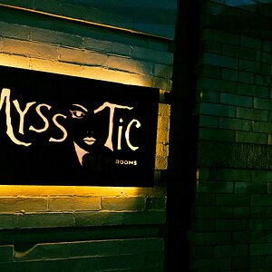
I set up my camera on the tripod, I think it was around F8, Shutter speed was 7 seconds or so, ISO around 400. I set the timer, got in front of the camera and took a small LED flashlight and wrote out the name of my company, but you have to write it completely backwards. Lol. It took many many tries. :thumbup:
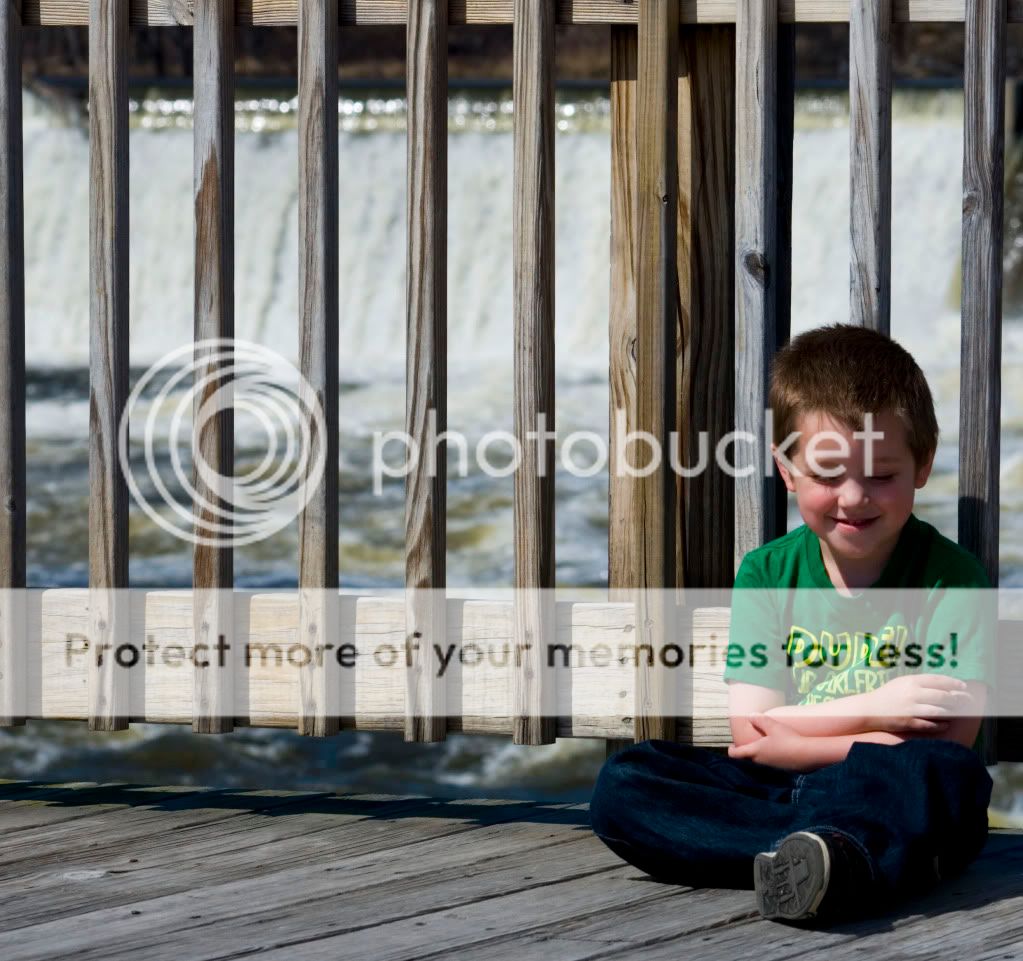
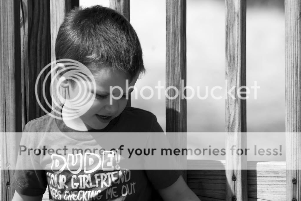
The first image seems to be a snapshot at best. It has a busy background, the child's face is slightly blurry, and it seems you tried following the rule of thirds a bit however in my opinion the child is too close to the side.
The second image has similar problems, although the background isn't as distracting since the focus is much more on the child. Still soft focus though. Also I think the black and white fits but needs to be worked with more in areas of contrast. Those harsh shadows throw some curve balls to work with.
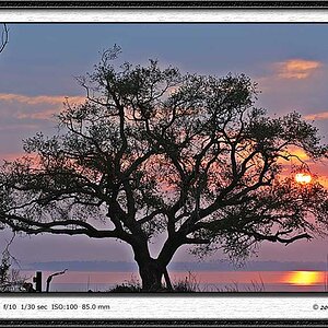
The third one is the best of the three in my opinion, the eye flow is nice even though there doesn't seem to be something to focus on (as in nothing is really sharp). I like it, but I think it could have been even better if it were possible to get the top of the far left tree in the picture. Of course I don't now what happens when you zoom out though so it could possibly ruin it as well.
The first image seems to be a snapshot at best. It has a busy background, the child's face is slightly blurry, and it seems you tried following the rule of thirds a bit however in my opinion the child is too close to the side.
The second image has similar problems, although the background isn't as distracting since the focus is much more on the child. Still soft focus though. Also I think the black and white fits but needs to be worked with more in areas of contrast. Those harsh shadows throw some curve balls to work with.
The third one is the best of the three in my opinion, the eye flow is nice even though there doesn't seem to be something to focus on (as in nothing is really sharp). I like it, but I think it could have been even better if it were possible to get the top of the far left tree in the picture. Of course I don't now what happens when you zoom out though so it could possibly ruin it as well.
Thanks! I definitely welcome constructive criticism. On the third one, it definitely is sharper in color but I thought the black and white fit a little better with the dreary day that it was.


") :thumbup:
:thumbup:![[No title]](/data/xfmg/thumbnail/33/33339-c5b461af62b32f6b6529f1b334d818ba.jpg?1619735909)


![[No title]](/data/xfmg/thumbnail/33/33338-4ae29c5eff506820d8b986c033234764.jpg?1619735908)