Just a few pics for C&C

meganm

TPF Noob!
Joined
Jan 27, 2010
Messages
18
Reaction score
0
Location
Southern Georgia
Can others edit my Photos
Photos NOT OK to edit
Okay guys, I joined a while back and have just been lurking ever since. I decided to finally post. I am open to any and all critique. This girl has a thick skin. I still have very much to learn, and a great way to learn is by understanding what you did wrong.

These are from a wedding I was second shooter on. this wedding consisted of only the bride and groom. No guests. Easy peasy.
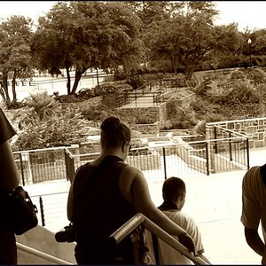
1.
mkvd38.jpg


2. I know some might now like the angle, and I think with a little bit less it would have been better, but I still like it. Also the fact the tip of the heart is cut off bothers me.
21bxaa.jpg


3. I love this one
23r7ait.jpg


Please let me know honest opinions!
Thanks, Megan
 
The last one is my favorite, even though it looks a little soft on her face. In the ring shot your focus on the rings seems a bit off. I don't care for the heavy tilt in the second, they look like they are falling over and the heart being cut would lead me to crop in closer and drop it out completely.
 
Thank you for the input. The ring shot looks spot on in Photoshop. Maybe its just the compression because it does look odd here!? I agree about the tilt in number 2. I had others with less tilt, but they were OOF. Im having to manually focus and sometimes it gives me a bit of a challenge!

Thanks again.
 
Very good examples of when the "artsy" angle does not work, and when it has some merit.

Angles suggest movement and motion, or unrest. Angles are very dynamic. In number two, the couple is very still. Very "at rest". The angle makes absolutely no visual sense. Now look at number three! The womans hair and dress seem to be falling away, he seems to be actually holder her up! This makes a lot of sense visually! The pose is dynamic.

Lesson: Don't use the artsy angle unless it makes sense. If it adds and works with the scene, composition, or story Yay! If not, NAY!
 
1. I think you needed more DOF, the oof green stems on the left center draw just sa much attention as the rings do.

2. I would rather see the focus on people than on the sand.

3. looks soft and again looks like the focus is not on the subjects.
 
Thank you very much for the 'angle' lesson! That makes perfect sense :)

Ryan, I think the softness or the OOF-ness of the last pic is due to compression mostly. It tooks way better full size. Thanks for the comments! On the first, how would you suggest getting more DOF? I had it on a pretty low Fstop.

You shot at f2.8, step it up a couple stops. F5.6 might have got there.
 

Most reactions

New Topics

Back
Top