IcyVeins
TPF Noob!
- Joined
- Aug 17, 2010
- Messages
- 11
- Reaction score
- 0
- Location
- San Jose, CA
- Can others edit my Photos
- Photos OK to edit
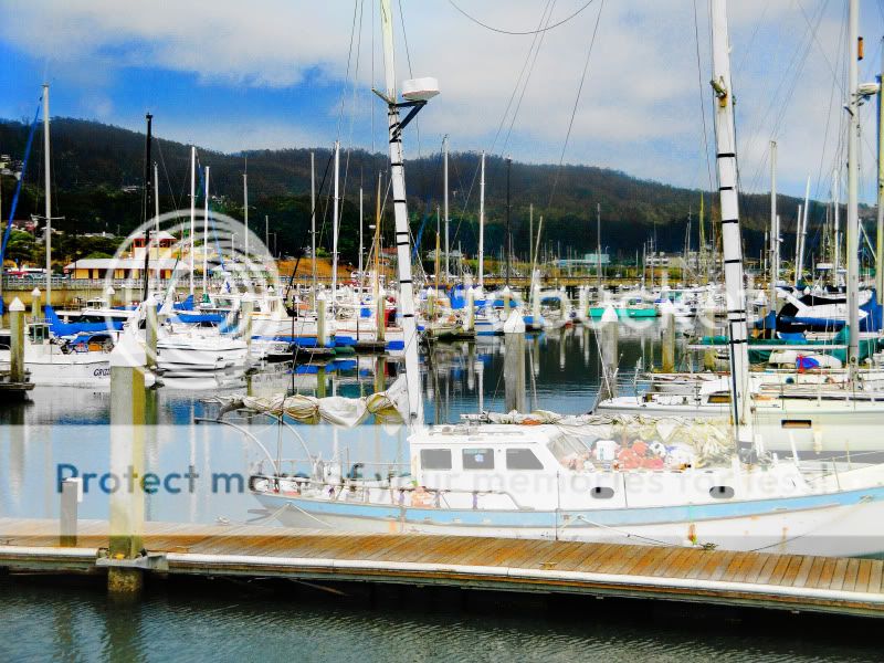
I took some photos at Half Moon Bay, CA for my 25th birthday recently with my Sony CyberShot W290, and am just getting around to editing them on Photoshop.
1.

This is the original shot.
2.
This is post editing, viz saturation, sharpening, and dodge/burn. Does this look like a decent finished product, or is there anything that could be noticeably improved? One thing I am considering is adding a lighting effect as the lighting is maybe kind of flat.
3.

This is a cropped artistic rendering. I kind of like it, but I'm not really a learned artist so I have a few questions. Is it too garish? Is it too obvious what filters and other effects I treated it with? Is the color scheme wrong? Can it be improved or is it a lost cause?
What I typically do when editing photos for artistic purpose like this is to try out several different effects and then fade them with different blending modes until I get something I like, then rinse and repeat until I like the finished product. So I often don't know what it's going to look like until I get to the end. Unfortunately I am kind of lazy and only how to use maybe half of the program's vast array of tools and functions. And even theones I do know how to use, I haven't really mastered them as in what situations they are most useful in.
One final thing I want to say is that I plan to start submitting images to websites like shutterstock.com (that is the only one I have found so far) so that I can sell them and make money. Are there any other good sites for doing this? Is #2 of a high enough quality to get accepted? Will they accept artistic renderings like #3?
Thanks to anyone who comments or critiques these images.
1.
This is the original shot.
2.
This is post editing, viz saturation, sharpening, and dodge/burn. Does this look like a decent finished product, or is there anything that could be noticeably improved? One thing I am considering is adding a lighting effect as the lighting is maybe kind of flat.
3.
This is a cropped artistic rendering. I kind of like it, but I'm not really a learned artist so I have a few questions. Is it too garish? Is it too obvious what filters and other effects I treated it with? Is the color scheme wrong? Can it be improved or is it a lost cause?
What I typically do when editing photos for artistic purpose like this is to try out several different effects and then fade them with different blending modes until I get something I like, then rinse and repeat until I like the finished product. So I often don't know what it's going to look like until I get to the end. Unfortunately I am kind of lazy and only how to use maybe half of the program's vast array of tools and functions. And even theones I do know how to use, I haven't really mastered them as in what situations they are most useful in.
One final thing I want to say is that I plan to start submitting images to websites like shutterstock.com (that is the only one I have found so far) so that I can sell them and make money. Are there any other good sites for doing this? Is #2 of a high enough quality to get accepted? Will they accept artistic renderings like #3?
Thanks to anyone who comments or critiques these images.
Last edited:


![[No title]](/data/xfmg/thumbnail/42/42494-ba608b57b09b00c0ee005a2360a510f5.jpg?1734177014)


![[No title]](/data/xfmg/thumbnail/37/37606-3c9ffb5906173fa2aa489341967e1468.jpg?1734170733)

![[No title]](/data/xfmg/thumbnail/39/39180-3dcdd0aa38e4d015a48a17b0e45542fb.jpg?1734173054)
![[No title]](/data/xfmg/thumbnail/36/36396-f8e84def7352af726df923054b86284f.jpg?1734168779)


![[No title]](/data/xfmg/thumbnail/37/37602-1ef8dbb1c2d0e4ff347ee65d328c3603.jpg?1734170730)