Bitter Jeweler
Been spending a lot of time on here!
- Joined
- Apr 27, 2009
- Messages
- 12,983
- Reaction score
- 4,993
- Location
- Cleveland, Ohio
- Can others edit my Photos
- Photos OK to edit
Follow along with the video below to see how to install our site as a web app on your home screen.

Note: This feature currently requires accessing the site using the built-in Safari browser.
")
White. All white gold is now rhodium plated. You know, to make it 'extra' white. :er:...and rhodium plating. (I think.. not my area)
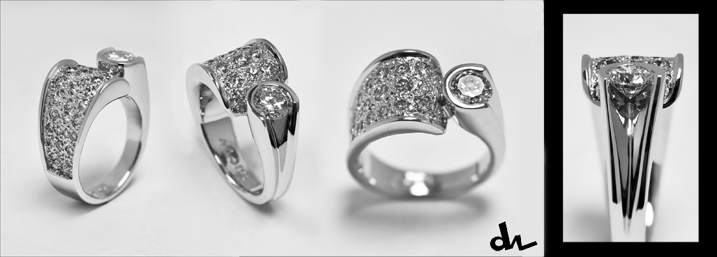
Is it yellow or white gold? - curiosity..
Criticism is always welcome.Let me start by saying I have no business giving you criticism AND I know you didn't ask for it but I might learn something from your reply.
I'm unsure of the composition. I don't know if it's a common layout for jewelry, or any product really, but the bordered ring on the right strikes me as odd. Also the lighting makes it look like it's leaning ever so slightly to the right. Also, I think the shadow in the 3rd image on the bottom could use some dodging..
I am going for "my take" and trying to be a little different. As far as the lean, yeah, it is leaning slightly right, to compensate for my imperfect wax carcing, making the ring uneven to the left. :meh: I hate seeing flaws when the job is done. When you spend a lot of hours on a piece, you start to not see things, if that makes sense.  I think you are right about the last shadow, I'll knock that back a bit. As for the border, I thought I had black border going around the whole image, half the thickness of that end block. It was 2am, again, I didn't see what happened to it. I was trying to use that last block as an inset to show detail of the stone setting, in that groove. If I left the ring image the size of the others, to follow along, you couldn't see the detail. I think now I should a) fill the frame with the ring detail, and b) thin the border. maybe making it even, and all the way around the image will help.
Yes, it is my design, and creation. I am learning to use the tilt shift lens, and it is interesting. I learned why all y shots so far have missed focus.I like the sharpness and the shallow depth of field, very pleasing to look at. You did great showcasing how beautiful the ring is (I assume you crafted it?).
On this lens you have to focus using Live View, and you have to press the depth of field preview button in to focus. I am however really happy with being able to focus across the top of a ring and blur the shank below. I can get much more in focus than with my macro lens. Problems, however, are dealing with chromatic abberation.:hug::I love the ring..
Do ya now? :er:I find it ironic Bitter, that you were so critical of a chef that wanted to shoot his own handiwork.
C'mon, Ron. If you are going to play the troll...


![[No title]](/data/xfmg/thumbnail/30/30888-e7fd3f6ad2e0d85268f086de6d796459.jpg?1619734499)
![[No title]](/data/xfmg/thumbnail/32/32160-4e45e524b050f1afae9fd21bf696d61b.jpg?1619735234)
![[No title]](/data/xfmg/thumbnail/30/30889-6a35eb14fac2d7d837d49a6a1757d874.jpg?1619734500)