Just one from the other night, and need some pointers

nthomas33

TPF Noob!
Joined
Feb 2, 2012
Messages
15
Reaction score
0
Location
South Jersey
Can others edit my Photos
Photos OK to edit
Figured I'd post the only shot I liked from the other night:

NightBridge2.jpg


Also, I was trying to get a good shot of this neon sign, but this is the best I could get:
VindlandSign.jpg


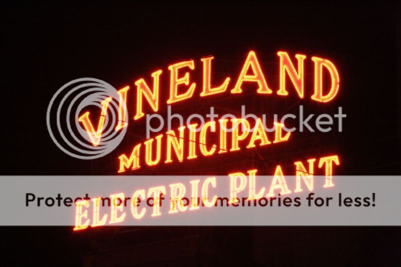
Basically I was trying to get the sign, with some of the structuring in there too, but it either came out way too dim, or it was just all sign. How could I get it so that the sign doesn't over power the shot and be able to get some of the building too.

Thanks
Nick
 
First impressions: the first one is not too bad, except the bridge and horizon are right through the middle of the image, read up on "Rule of Thirds" if you are not aware of it. You also seem to have a bit of colour noise in the darker areas of the sky . The second one is not too bad, although the image looks a little fuzzy to me. I suspect that photographing images of these sorts of signs is not all that easy. As far as getting better images of neon signs, have a look at this, to see if it helps at all: How to Photograph Neon Signs, Tutorial, Jeff Wignall .

Cheers,

WesternGuy
 
Thank you very much for te link and the critique. I tried to get the bridge to one of the thirds, it's just a little tricky from that spot. The only other spot I know to get a better angle, I have to wait for the tide to go out. I'm going to look around for some better angles, I don't know why I just love taking pictures of bridges.

The sign one is a little fuzzy, because I was using an FD zoom lens, and for some reason I can't get it to focus right. I'm going to check out that link and go back there with my digital lens

Thanks again,
Nick
 
You just need to shoot earlier in the day so the ambient light is more balanced with the light from the sign. Because they are both constant light sources, it's all about time of day.

Concerning #1, I think you would benefit by finding a composition that "opens up" the bottom part of the image. What I mean by this is having some reflection, or perhaps something with a lighter tone. Right now that strong horizontal line is a strong border below which almost nothing interesting lives. I say "almost" because I see a puddle or something reflecting some lights. That could be used to make the composition more interesting.

Also, the bridge, at least to me, is too small in the frame. I'd like to see some more detail. This will either require a larger res image, or a different composition.

Finally, I personally am not a fan of the typical sodium vapor light color (orange) and think that this shot might benefit from a B&W conversion, or some color adjustment.
 

Most reactions

New Topics

Back
Top