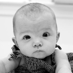
I'm not a fan of placing people off-center and looking out of the frame on the short side of the frame...it causes visual tension, and she has a quiet, tranquil expression, so for me #1 has nice light on her, and is technically well-done, but I dislike the composition because the expression seems to contradict the framing. I held my hand up to the screen, and 'cropped' it to both a square, and to a tall...both looked better to me. The quality of the LIGHT really shines in #1 though...beautiful lighting, lovely expression,nice exposure, good processing.
#2...yeah, the perspective does make her nose seem overly large and prominent. and as Lew mentioned, the tint on it is not a tint I enjoy in this instance.
I like No 1 very much. The curl on her left side (right side on the pic - looking up) looks a bit untidy by pro glamour standards, but it is really a nit picking. No 2 - I agree with previous comments.


![[No title]](/data/xfmg/thumbnail/33/33342-79274d7e5cdf3e52939255e1cd89f2d0.jpg?1619735911)