Welome to TPF!
Opinions per req:
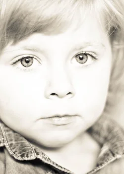
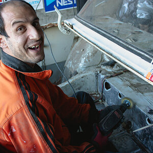
1. Just a little bit hot, and I think your key needs to move a bit more to one side or the other. I prefer a less tightly composed image, but that's a personal thing.
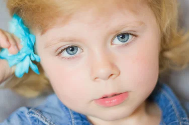
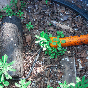
2. Not bad; a little more contrast in the lighting and a bit more DOF wouldn't go amis.
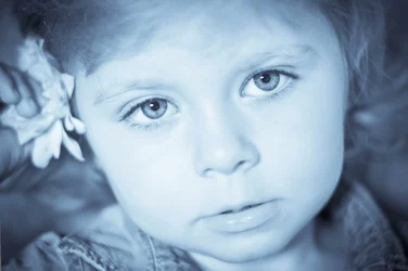
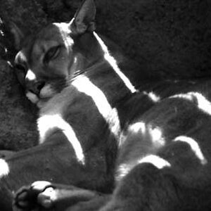
3. Blue is almost NEVER a good colour for skin!
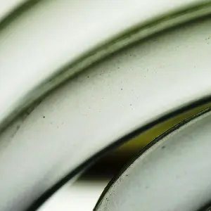
4. Not fond of the very OOF hand and flower in the foreground.
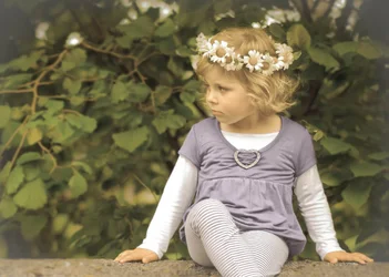
I think you've got some good potential with these, but perhaps a little more tweaking in post?
Just my $00.02 worth - your mileage may vary.
~John













![[No title]](/data/xfmg/thumbnail/32/32715-2fc6326453c7dda13dae0bbb0cc16864.jpg?1734162341)

![[No title]](/data/xfmg/thumbnail/30/30880-eb7252c7e6df26b6cbc7065d2838df96.jpg?1734158883)


![[No title]](/data/xfmg/thumbnail/37/37605-90c8efaef5b7d1f52d4bf8e7dfd33673.jpg?1734170732)
![[No title]](/data/xfmg/thumbnail/32/32712-779fdbfe2a0a6166b7dfdd81426fd16a.jpg?1734162324)