Landscapes from Bar Harbor today C&C

Ernicus

TPF Noob!
Joined
May 18, 2012
Messages
2,689
Reaction score
337
Location
Old Town, ME
Can others edit my Photos
Photos OK to edit
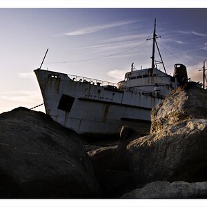
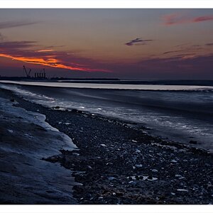
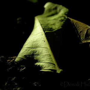
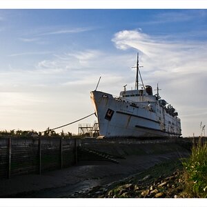
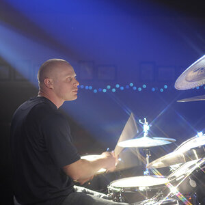
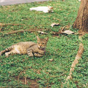
Went to Bar Harbor today to scout out where I want to go shoot on my next visit. Took a few while there. Here are some, haven't gone through the rest yet.

I am happy with where I am vs. where I was...however I don't think they are quite where I want to be with them yet.

C&C at will.

1


View attachment 12185


2
$_DSC0082-3.jpg


3
$_DSC0085-1.jpg
 
I find landscapes to be about as interesting as dried yellow paint, but that second and third one are stunning. Very pretty and very nicely executed.
 
Thank you very much. I don't particularly care for landscapes either. My difficulty has been capturing the "coolness" of being there and what I'm seeing. They always come out boring and icky for me.

1 is pretty boring, just a hotel on the water. I took that to see if I could get a good clean clear shot basically. 2 and 3 looked pretty cool when I was there, so I laid on the ground and rocks for about 30 minutes trying out various shots and settings to try to capture it.
 
Does this one work for anyone? I am not sure. I'm thinking too contrasty...and boring, at first glance...but then I'm kinda like "well...maybe it's ok". Am I being too critical or does it suck?

$_DSC0167-2.jpg
 
I love all of them but then again I love landscapes too
 
The first one makes a nice postcard, but other than that, it does nothing for me. I do like the second and third ones, particularly the second one. From a compositional perpsective, the shorelines and the lines created by the tops of the trees take the viewers eye and move it through the picture without taking it out of the picture, which is one of the things that lines are supposed to do in an image. The viewer then sees the sky - nice sky by the way. In the third one, the lines tend to take the viewers eye from the left side to the middle right and then potentially out of the picture - not as good as the second one. My 0.02¢ FWIW.
_____________
WesternGuy

Thanks for your input. I was thinking that about the 3rd as well. The 2nd has the lines that say "look at me...check out this awesome view" and keeps you on it. as you say, the 3rd says "cool...look over....here......" but wait...there's nothing over there. lol. It's still pretty...but yeah...has you fall off the image.
 
I love the second one, I'm not particulary interested in landscape photography, but these kind of deep landscapes get me every time. The colours look great, too! Would you mind sharing EXIF data? did you take it with the D3100 and kit lens?
Is that close from where you live? if so, I'm so jealous...
 
Yeah, it's about 1.5 hours away. I will be making many trips. There is much to shoot out there. It really helps to have pretty stuff to shoot. lol. This is just a place I pulled off the road that stuck out and hit me while driving around scouting. My next visit will be to top of Cadillac Mountain for some stunning (hopefully) shots.

I used the kit lens on my 3100. I was very leary going into it and kinda bummed I didn't find a good zoom to use, so I told myself to take my time and do it right and see what I get. lol.

Exif

18mm
f/8
1/250s

Spot metering (metered for upper left hand portion of sky as it was super bright up there)
Single point AF (tried hard to get the right hyperfocal distance on this one)
VR was turned off.
 
1 is a nice capture of a beautiful building, but I think it could be improved with a few quick clones... Specifically the mooring on the left hand side, and the person on the right hand side.

2 is great. Love the could detail.

3... Pretty good, BUT the horizon is pretty much dead center. That's kind of a 'no-no' in landscape photography.

For being into photography for as long as you have, you should be happy with these. Nice work Ernie.

Thanks man, that means a lot.

Good call on 3. I wonder if I was thinking of a crop on 3, I normally don't put horizon dead center. Or I just goofed. LOL.
 
....now if I can pop out some nice portraits, I'll be happy with my progress thus far. We'll find out in a week or two won't we? lol
 
Nice work Ernicus...Loved 2nd the most..
Can you post exif for 2nd pic..?
 

Most reactions

Back
Top