Latest Senior Pictures

jlykins

TPF Noob!
Joined
Dec 1, 2007
Messages
1,235
Reaction score
3
Location
Cincinnati
Website
www.jlykinsphotos.com
Can others edit my Photos
Photos OK to edit
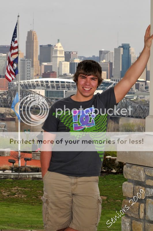
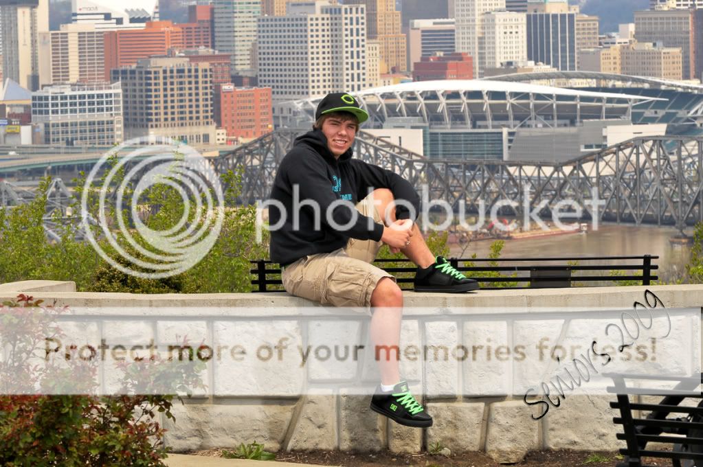
Did some Senior Pictures Friday. It Rained all day, then he showed up to the studio and we caught about a 45 minute break in the rain so we ran up to the park and did the outside stuff before it started raining again. Before anyone says anything, I know it looks as though he's squinting, but his eyes are shaped wierd which caused them to look like that. I stopped and asked him to open his eyes up a few times throughout the session but that was the best he could do. Here's a few:

1
JRL_0972copy.jpg


2
JRL_0941copy.jpg


3
JRL_0948copy.jpg


4
JRL_0954copy.jpg


5
JRL_0940copy.jpg


6
JRL_0952copy.jpg


7
JRL_0999copy.jpg


8
JRL_1030copy.jpg


9
JRL_0987copy.jpg


10
JRL_0985copy.jpg
 
1- Not sure what the subject is in the picture, him or the city. Try filling your frame more with your main subject, else it looks more like a snapshot

2- A bit too much dead space over his head that is not adding to the picture. Seems he was looking into the sun and thus squinting. I also find his shirt busy and thus it draws me eye more than he does

3- Love the shades, but again, try and fill your frame with him. Alot of dead space over his head that isn't adding much. With such a fun prop, get in close on them!

4- Similar comments than #1. He is too centered in this one

5- He looks very red, squinty eyes, not sure on main subject

6- Similar to #4

#7,9,10 - Seems that your exposure is a bit off as there is next to no detail in the black of his shirt (might be my monitor though)
I also find that 9 and 10 have alot of dead space on top of his head.
 
I can't decide if I like 7 or 8 better ftw. But, I think they are the tops of the set I am impressed that you got his eyes in that shot. :)

Well, normally I don't really like the look of studio stuff as much as environmental stuff. But this would definitely be the exception.

On the environmental shots here, The relatively in focus background really distracts from the focus of the young man.

Also, in a number of these shots he looks quite red to me (particularly #5).

#2 might be improved by cloning out the people behind his right elbow.

I was going to make a comment about the squinting, but then after I read what you mentioned I did notice how his eyes were a little unusually shaped. My suggestion there may be to get some more head shot images where you can actually see the eyes, like you did in the studio set up.
 
Thanks for the input. I think the exposure issue is with your monitor. I'm working on a calibrated monitor and the shirt has detail. Also in the prints it has detail.
 
I can't decide if I like 7 or 8 better ftw. But, I think they are the tops of the set I am impressed that you got his eyes in that shot. :)

Well, normally I don't really like the look of studio stuff as much as environmental stuff. But this would definitely be the exception.

On the environmental shots here, The relatively in focus background really distracts from the focus of the young man.

Also, in a number of these shots he looks quite red to me (particularly #5).

#2 might be improved by cloning out the people behind his right elbow.

I was going to make a comment about the squinting, but then after I read what you mentioned I did notice how his eyes were a little unusually shaped. My suggestion there may be to get some more head shot images where you can actually see the eyes, like you did in the studio set up.


My personal favorite was #8. I'm going to pull up the other shots in PS and check the colors. I agree that they do look red like you guys were saying. I wish I had more time with him at the park(it started raining on us) I had planned on spending a lot of time at the park and then doing some stuff down by the railroad. I could have identified the issue with his eyes faster and done some more close up shots. Also I didn't do a custom white balance(which I almost always do) which I think would have fixed the problems with the skin tones. I may call him and ask him if would like to come back out for a few more shots.
 
His shoes in 3-4-5 also have lack of detail
I do see detail on his shirt in #8, on his left side (camera right).
But I'm at work with a crappy Dell monitor hehe.
 
#1 Backgrounds too busy, its out of focus, he seems underexposed by about 1/3 of a stop.

#2 Still doesnt look completely sharp and the background is too busy, try a smaller aperture. Plus there are other people in the background!

#3 This one is better, looks like you got the focus nailed, but the background still looks a little busy to me.

#4 Same as #1

#5 I like the lighting on this one, but the background is still really distracting.

#6 Same as #1 and #4

#7 Focus is off

#8 Good shot, dont like the step ladder

#9 Dont like the crop, youve chopped off his hands and his shirt has lost all its detail, just looks like a black blob.

#10 I guess I dont like the sitting on the stool thing, looks kinda boring and isn't really that flattering. Lost detail in shirt too.
 
I'm at home checking on my better monitor here and I still have issues with the loss of detail on the right side of his shirt in 8-9-10
 
you guys need better monitors :p (joking of course)

on my laptop monitor the shirt is just flat black, i have a couple IPS panels here though and there is quite a bit of detail, so i can see how a print would bring out that detail a little more.
 
I appreciate the comments and critiques. I will address all of these issues that have been brought up. Thanks!
 
Just to counter others I am seeing a lot of detail in the black dress shirt. It's got some kind of texture stripe pattern going on.
 
I'm able to see detail in the shirt as well. There are stripes forming a V shape on the chest, and similar stripes on the arms.
 

Most reactions

Back
Top