What's new

Life is Art...

charlie76

No longer a newbie, moving up!
Joined
May 9, 2012
Messages
1,635
Reaction score
460
Location
Vermont
Can others edit my Photos
Photos OK to edit
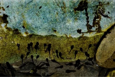
Took this yesterday...hope u guys like it. Comments are welcome:)
 

Attachments

  • $image-2471374316.webp
    $image-2471374316.webp
    130.8 KB · Views: 104
Tadpole on differently coloured rocks?
Has a paintlike feel to it, admitted! It could be my screen (am on the notebook), for the time being, howevever, it looks a bit dark, but as I'm saying: notebook screen - never quite as good...
 
That's a wonderful tadpole composition. I love the colors, the textures, and the memories of swimming in rivers as a kid that it evokes.
 
I see two different images here: (1) the black things in the lower half of the frame, and (2) the complicated figure in the upper right. It would be better to frame either one but not both, and if you decide you really want both, don't cut off part of the upper right figure. To me the most interesting shot would be the right 1/3 of the frame plus a little more on top and the right. Abstracts are pretty subjective stuff, so you'll always get a variety of opinions/suggestions, so this is just my take on it. Keep shooting!

 
Charlie, this is really wonderful .... i liked its three strata of colors from a brilliant top top to a dark bottom.....

Regards :D
 
Rotanimod said:
Raise your hand if at first you thought sperm!!!

I have a problem... :lmao:

LOL...that's the assumption I was using to throw a spin on this shot! It's like a sperm-in-outer-space picture...rather than a tadpoles at the river. They all thought it...but won't admit it!
 
LaFoto said:
Tadpole on differently coloured rocks?
Has a paintlike feel to it, admitted! It could be my screen (am on the notebook), for the time being, howevever, it looks a bit dark, but as I'm saying: notebook screen - never quite as good...

Yep you got it. And yes...I am having problem making my notebook screen look the same as everyone else's. It is lighter on my screen but I have no adjustment options on mine!! I love the paint like feel too...thx:)
 
KenC said:
I see two different images here: (1) the black things in the lower half of the frame, and (2) the complicated figure in the upper right. It would be better to frame either one but not both, and if you decide you really want both, don't cut off part of the upper right figure. To me the most interesting shot would be the right 1/3 of the frame plus a little more on top and the right. Abstracts are pretty subjective stuff, so you'll always get a variety of opinions/suggestions, so this is just my take on it. Keep shooting!

Thanks for the comment. It looks right on my laptop screen...can't get it to look right on everyone else's. Thanks for the critique...appreciated:)
 

Create an account or login to comment

You must be a member in order to leave a comment

Create account

Create an account on our community. It's easy!

Log in

Already have an account? Log in here.

Back
Top Bottom