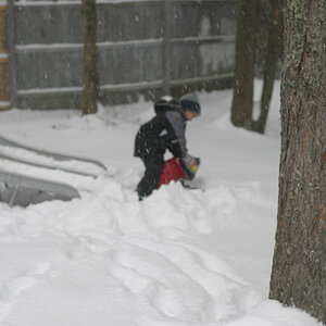
When I saw the first one, I thought to myself "he should try and shoot this at the end of the day". Then I saw the last one, which is exactly what I had thought you might want to try.
With lifeguard stands as cool as these, this is a neat idea for a series.
(Watch your horizons... they are a tad crooked.)
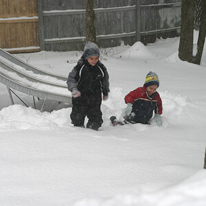
Thanks for the comments guys. I think they are all cool, but I agree about the background distractions, I think that's what makes the 3rd one my favorite. Will try to work on that going forward!
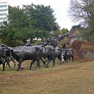
Last is the best followed by the first; middle one has too much a busy back settings.
See in all the three i perceive a tilt which may please be corrected
Last is the best followed by the first; middle one has too much a busy back settings.
See in all the three i perceive a tilt which may please be corrected
in the unedited version the horizon is straight but the lighthouse stand is crooked... i thought having the subject straight would bet the least visually offensive ... but now im conflicted... thoughts ?
in the unedited version the horizon is straight but the lighthouse stand is crooked... i thought having the subject straight would bet the least visually offensive ... but now im conflicted... thoughts ?
crooked water is something really unnatural, although also a crooked main subject might be annoying. You may try to work a little with the lens distortion controls in Lightroom, maybe you may be able to repair it. Or redo again with a longer focal length (staying far). But the idea is good (the last in particular).
However, I do like #1 too. The vibrancy of the colors on the tower, flags, and people is really great. I think it could be tweaked to have a straighter horizon, but otherwise, a good job.
#2 is interesting, but the background is too distracting for me (repeating geometric shapes of the windows, tents, etc). If you can, you should shoot this from another angle or with narrower DOF. :thumbup:


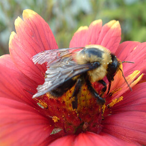
![[No title]](/data/xfmg/thumbnail/33/33342-79274d7e5cdf3e52939255e1cd89f2d0.jpg?1619735911)
![[No title]](/data/xfmg/thumbnail/33/33343-857a08c1327857172779bfe49f06f638.jpg?1619735911)