What's new

lighthouse

photocist

TPF Noob!
Joined
Oct 21, 2010
Messages
605
Reaction score
57
Location
Oakland, CA
Can others edit my Photos
Photos OK to edit
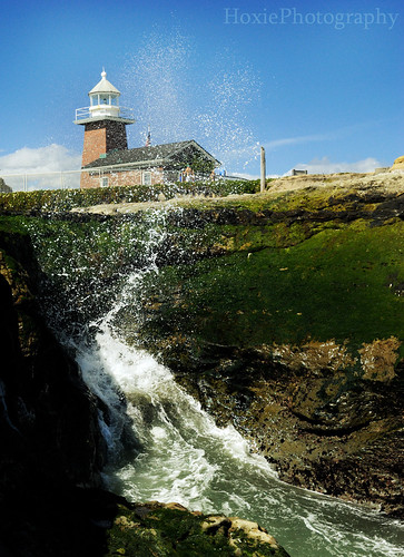
Took this in santa cruz. Do people feel the splash in front of the lighthouse is distracting? Not really sure what to make of it... And does the black and white conversion work well? The colors were pretty good (very vibrant greens) but the black and white seemed to emphasize the water a bit more.
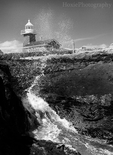

lighthouse by Hoxie Photography, on Flickr

Thanks for looking!
 
I don't think the water distracts but the image is lacking detail or 'pop' to keep my eye. I go here a lot, used to live just down the street :)
 
I agree with Trever1t - i'm not sure what your focus point is. if it wasn't for the title of the thread i would've guessed you're trying to show the splash water is creating.

post the one with colors and see if that makes a difference.
 
Here is the color shot


lighthouse copy by Hoxie Photography, on Flickr

Thanks for the replies. I would not say the subject of the photo is the lighthouse, but rather have the water and lighthouse compliment each other.
 
The spray distracts me from the lighthouse.... the lighthouse distracts me from the spray.

And both are a bit off-center to me.
 
They were intended to be off center. Thanks for the comment though. I will have to get over there some other time and take a few more shots ^^
 
This shot actually more brings out the splash than the lighthouse.
But it's a good shot :) I like it.
 
Maybe I am asking the wrong question. It seems like the lighthouse is distracting from the splash. Do people think that would change if the water was not over the lighthouse, but to the right (curled from bottom left to upper/mid right) and/ or not as high?
 
If the splash was not so high or like you said bottom left to mid right, it'd be balanced.
Depending on the person, you'd see the lighthouse that leads to the splash or the other way around.

The way it is now, it just seems like the lighthouse shouldn't be in the picture.
Just the splash.

Just my opinion though haha.
 
I love this image in B&W, though i think a name chang would be in order. in B&W the splash cought my eye well befor the light house did. I took the light house as a backdrop for natures beauty. In color I feel the two are to jumbled to pick out a winner. Its like a fight that goes to the final round....... not many people like it.

Keep the B&W I love it.
 

Create an account or login to comment

You must be a member in order to leave a comment

Create account

Create an account on our community. It's easy!

Log in

Already have an account? Log in here.

New Topics

Back
Top Bottom