Lighting/processing issues?

MKandiko

TPF Noob!
Joined
Nov 28, 2009
Messages
4
Reaction score
0
Location
Houston, TX
Can others edit my Photos
Photos OK to edit
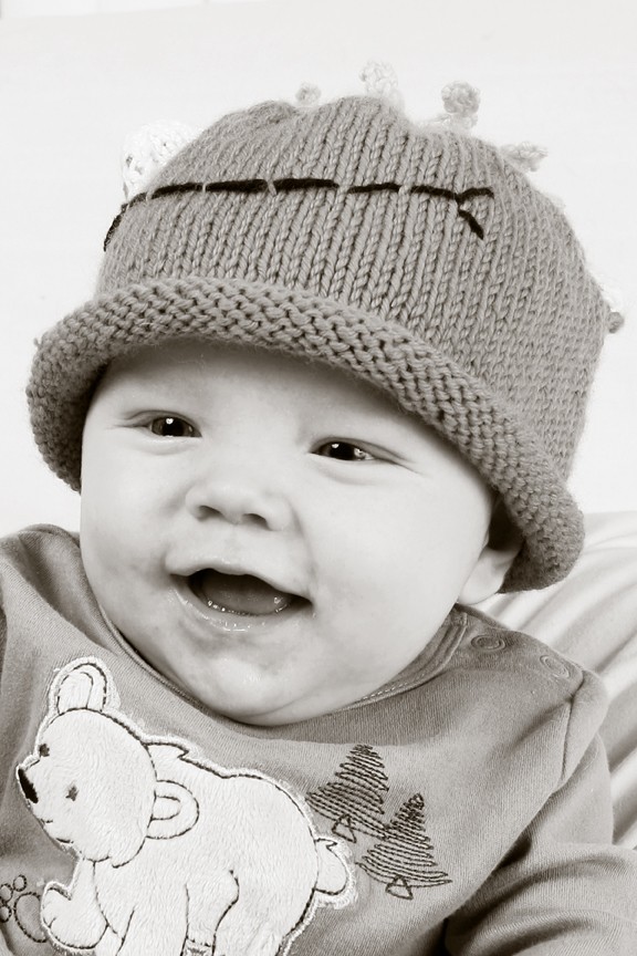
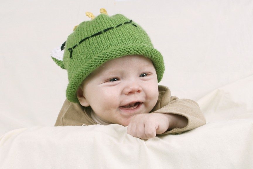
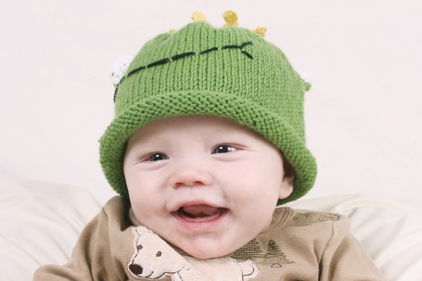
I have been trying to improve my lighting for children and baby portraiture but seem to be having some issues. I use two Smith Victor Flash Strobes that are 200 watt seconds. For this shoot I reflected off of an umbrella for each light. One light was off to the left of the subject above the subject and was used as a main light. The second light was directly to the right of the subject and almost at the subjects height. That was used as a fill and at a lower setting. The background was a very light yellow. My question is how can I improve the quality here or is it mainly in how I edited them in photoshop? Here some samples...Thanks for any help anyone has to offer...
4140145199_d22a77e40a_o.jpg

4140144975_5f794dd00c_o.jpg

4140904724_c27fb7e77c_o.jpg

One switched to BW
 
If you're wondering about colour balance then buy a grey card to do white balance correction with. No studio should be without one.
 
My question is how can I improve the quality here
What exactly is your question about the quality?

The one problem that stands out to me, is that it looks like the most in-focus part of the image is the front of the hat...when it should be the subject's eyes.
 
I think the photographs could be dramatically improved if you changed the baby clothes to more cheerful colors. The green and tan together look kind of drab to me. I actually think the hat could be okay paired with another color, but the shirt is too close to the baby's skin color and the drawing on it competes for attention too much IMO.
 
I am having troubles with my lense and that could have something to do with the focus issues, it is just not focusing well, I need to get it fixed but I guess does the lighting look like it's correct and the color? I am part of another forum and they usually rip my photos apart and I figured I'd venture to a photography specific forum and see what the problem really was. I will try with brighter colors. I just want to the subject to not be too flat and just look like a professional image. Thanks.
 
If you want it to look like a professional image, you'll move that fill light away from the right hand side of the shooting area,and position the fill light very close to the camera. Having the fill light so far off to the side is giving you a one-catchlight/two-catchlight eyeball situation,which looks odd. Also, your main light is giving a small catchlight,and the fill light a much larger one, with the light visible in the center of the umbrella's reflection.

The way these are lighted, you have a very flat, lifeless 1:1 lighting ratio, with almost no shape or modeling on the face. The only shadow is a slight shadow under the nose. The fill light is too strong, and it looks like the fill light umbrella is larger than the main light, which is a small thing, but one we're not used to seeing--the main light's catchlight ought to be the larger of the two,and having that catchlight only on the camera-right eye looks bad.
 
Last edited:
Thanks, that is something I can work with...I think the larger fill light is just because it's closer, the umbrellas are the same size. Until now I have not had any lighting help, it's all been self-taught and I knew something was wrong but I didn't know how to fix it.

If you want tit to look like a professional image, you'll move that fill light away from the right hand side of the shooting area,and position the fill light very close to the camera. Having the fill light so far off to the side is giving you a one-catchlight/two-catchlight eyeball situation,which looks odd. ALso, tyour main light is giving a small catchlight,and the fill light a much larger one, with the light visible in th center of the umbrella's reflection.

The way these are lighted, you have a very flat, lifeless 1:1 lighting ratio, with almost no shape or modeling on the face. The only shadow is a slight shadow under the nose. The fill light is too strong, and it looks like the fill light umbrella is larger than the main light, which is a small thing, but one we're not used to seeing--the main light's catchlight ought to be the larger of the two,and having that catchlight only on the camera-right eye looks bad.
 
The Internet is chock full of lighting help.

YouTube has hundreds of videos about lighting and there is always Google.

Then, there are books like: Light: Science and Magic An Introdution To Photographic Lighting. By Fil Hunter and there are many others.
 
The light in your photos looks very flat. Try turning your fill flash to 1/2 power of the main flash. This will give you some contrast and depth. Play with your light positioning.
 
Thanks, that is something I can work with...I think the larger fill light is just because it's closer
Try reversing that.

You typically want your main light to be softer (having it closer to the subject will do that) because it's the one that creates the shadows. The fill light doesn't necessarily need to be soft because it shouldn't be casting shadows (it's just fill light).
As mentioned, try moving the fill light closer to the camera position...and maybe further back as well.
As an exercise, try using just one light (turn off the fill). Pay attention to where the light falls and where the shadows are. Having this look good is the function of the main light. The fill light is just for adding light to the whole scene, thus brightening the shadows.

Of course, when shooting babies...or just kids in general, it's hard or impossible to get them to actually 'pose' for you....so you may not be able to get the light & shadow patterns just the way you want. But by changing the ratio of main & fill, you can still get more dimension to your images.
 

Most reactions

Back
Top