brittanyrose864
TPF Noob!
- Joined
- Aug 22, 2011
- Messages
- 35
- Reaction score
- 2
- Location
- South Carolina
- Can others edit my Photos
- Photos OK to edit
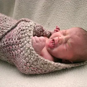
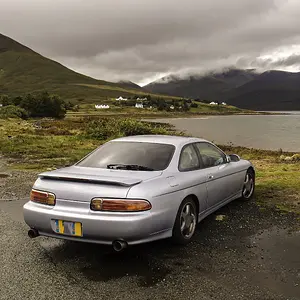
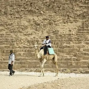
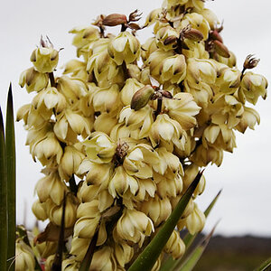
Let me know which one you think looks best...
1.

2.

3.

What are your thoughts?
1.
2.
3.
What are your thoughts?


 I had to do some burning on the sephia one because of the arm being so bright :-/