Little Church on the Prairie (colour vs. B&W)

Which version should I keep?

  • Colour

    Votes: 3 37.5%
  • B&W

    Votes: 4 50.0%
  • Neither

    Votes: 1 12.5%

  • Total voters
    8
  • Poll closed .

invisible

Been spending a lot of time on here!
Joined
Mar 10, 2007
Messages
5,213
Reaction score
983
Location
Canada
Website
www.federicobuchbinder.com
Can others edit my Photos
Photos NOT OK to edit
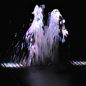
Some radical processing (by my standards) for an image made in radical conditions – I was wearing The North Face's 3-in-1 gloves (i.e., very warm) yet my fingers still froze.

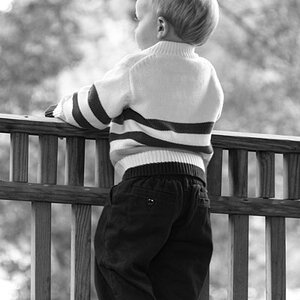
Colour vs B&W... Which one should I keep?

p1015620052-4.jpg


p318425581-4.jpg
 
Sorry! I mean to vote for the B&W. I miss clicked. Subtract 1 vote from neither and add 1 to B&W.
 
For me it's about the shapes in the snow leading up to the building and the horizon. The color just distracts from that.
 
i like the colored photo, but im gonna go with the black and white, like previously mentioned the color distracts from the main subject. Great Composition!
 
I am much confused of an option, and tossed on black and white. I did not vote because it is not based on count, but one's own deliberate decision that must be final ;)
 
I see no reason not to keep both, but not an option so didn't vote.
 
The color version seems more 'real' to me. It's puts me in that scene and even makes me feel the cold wind. The color transition helps to draw my eye from left to right across the frame.

The B&W version, on the other hand, gives me a very different feeling. I look at the snow and wonder if it's actually a sandy beach. The texture becomes a message of the photo, rather than temperature, which seemed to be part of the message of the color version.
 
Depends on what you're trying to say. The blue version says "cold"; the B&W version says "lonely"...at least to me.
 
Depends on what you're trying to say. The blue version says "cold"; the B&W version says "lonely"...at least to me.
Thanks, I think you're spot on. Loneliness and isolation is what I had in mind.

The color version seems more 'real' to me. It's puts me in that scene and even makes me feel the cold wind. The color transition helps to draw my eye from left to right across the frame.

The B&W version, on the other hand, gives me a very different feeling. I look at the snow and wonder if it's actually a sandy beach. The texture becomes a message of the photo, rather than temperature, which seemed to be part of the message of the color version.
On another forum, someone mentioned the snow looking like sand as well. I would've never thought of that, but you guys might be onto something.

Thanks everybody for your feedback and votes.
 

Most reactions

Back
Top