hannaschelling
TPF Noob!
- Joined
- Mar 31, 2014
- Messages
- 26
- Reaction score
- 7
- Location
- Vancouver, WA
- Can others edit my Photos
- Photos OK to edit
Hi,
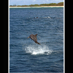
Do any of these logos have potential?
Thanks for your opinions!
-Hanna

Do any of these logos have potential?
Thanks for your opinions!
-Hanna


![[No title]](/data/xfmg/thumbnail/35/35867-0c74c728d92f908264af585fd93bd36c.jpg?1734167586)





![[No title]](/data/xfmg/thumbnail/31/31094-f975d7e61424996edc28cec3b9dd70a8.jpg?1734159245)
![[No title]](/data/xfmg/thumbnail/42/42492-60144191c917c21139f8acd72f6ba090.jpg?1734177011)