What's new

Long road to stormy country, and 2 valley panoramas for C&C

Tight Knot

No longer a newbie, moving up!
Joined
Nov 30, 2010
Messages
1,398
Reaction score
159
Location
Boca Raton, FL
Can others edit my Photos
Photos OK to edit
Hi all,

Hope you enjoy. C&C always appreciated.
 

Attachments

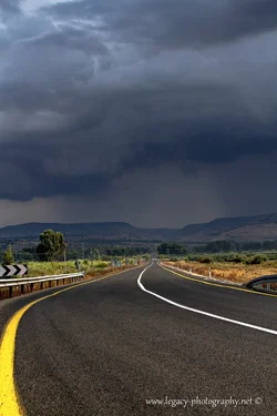
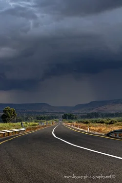
  • $Road 87 into the Golan.webp
    $Road 87 into the Golan.webp
    132.1 KB · Views: 179
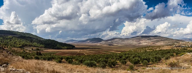
  • $Galil farming valley.webp
    $Galil farming valley.webp
    443.4 KB · Views: 224
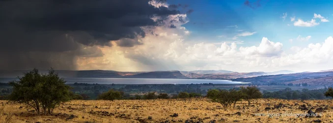
  • $Storm over the Kinneret and Golan.webp
    $Storm over the Kinneret and Golan.webp
    289.6 KB · Views: 211
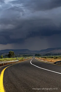
First impressions: the first one is not too bad. The only thing I would do is to crop off a bit on the left side - between the end of the >>> sign and the tree to get rid of the large piece of yellow line as it tends to dominate the image and draws the viewers attention away from the main subject - the stormy clouds. The second and third ones are also okay, except you have placed the horizon, even though it is not perfectly flat, almost exactly in the middle of the image. Check out the "rule of thirds" for horizon placement. HTH.

WesternGuy
 
First impressions: the first one is not too bad. The only thing I would do is to crop off a bit on the left side - between the end of the >>> sign and the tree to get rid of the large piece of yellow line as it tends to dominate the image and draws the viewers attention away from the main subject - the stormy clouds. The second and third ones are also okay, except you have placed the horizon, even though it is not perfectly flat, almost exactly in the middle of the image. Check out the "rule of thirds" for horizon placement. HTH.

WesternGuy

Hi Western Guy,

Thanks for the C&C :thumbup:
I specifically left the yellow line in, as I felt it starts the eye there, and then the eye naturally follows down the road into the storm. I will have to look at the photo a few times to see if I change my mind.
You are correct about the other 2, but no matter how much I played with them from the actual capture through post-processing, I couldn't find any compostion I liked except for the horizon close to center.
Do you want to try some edits to show me what you had in mind?
 
First impressions: the first one is not too bad. The only thing I would do is to crop off a bit on the left side - between the end of the >>> sign and the tree to get rid of the large piece of yellow line as it tends to dominate the image and draws the viewers attention away from the main subject - the stormy clouds. The second and third ones are also okay, except you have placed the horizon, even though it is not perfectly flat, almost exactly in the middle of the image. Check out the "rule of thirds" for horizon placement. HTH.

WesternGuy

Reposting with 3 different versions next to each other for easier comparison. A photoshop of my original removing part of the line, my original and the WestergGuy's recommendation.

I'm not sure which I prefer, but I think I'm leaning to WesterGuy's, even though I like the extra yellow in my original.

Let me know what you all think. Thanks.
$Road 87 into the Golan - 3rd.webp
 

Attachments

  • $Road 87 into the Golan - 2nd.webp
    $Road 87 into the Golan - 2nd.webp
    125.2 KB · Views: 182
Last edited:
I really like the cloud formations and contrasts.

The last panorama, where did you take it? Monolake?
 
I really like the cloud formations and contrasts.

The last panorama, where did you take it? Monolake?

Hi Dikkie,

Thanks.
The last panorama was taken of the Sea of Galilee or as it is known in Israel, the Kinneret. It is the largest lake in Israel.
 
I agree that having the yellow line in the shot is an improvement. Being the brightest part of the shot it immediately grabs the eye and then pulls the view right to the background storms. Well done in my opinion.

In the other two I don't feel that the horizon is centered. The tops of the mountains might be, and that could arguably be the horizon, but in shots like this it is somewhere difficult to decide where the horizon truly is. Again, I like it right where you have it in the original post.
 
I like the yellow line. I DO think the black and white chevron is a little distracting, not sure if that could be cloned out. Like the other two as well, no problem with the composition for me.
 
I agree that having the yellow line in the shot is an improvement. Being the brightest part of the shot it immediately grabs the eye and then pulls the view right to the background storms. Well done in my opinion.

In the other two I don't feel that the horizon is centered. The tops of the mountains might be, and that could arguably be the horizon, but in shots like this it is somewhere difficult to decide where the horizon truly is. Again, I like it right where you have it in the original post.

Thanks SCraig. That's why I left it in originally.
With these panoramic shots of mountains etc. I usually find it difficult to tell which part of the horizon is classified as the "center", and therefore ignore the rule of thirds, and just go by "gut feel". I personally think they're both well composed.
 
I like the yellow line. I DO think the black and white chevron is a little distracting, not sure if that could be cloned out. Like the other two as well, no problem with the composition for me.

Thanks thosewhotell,
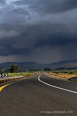
What do you think of this one?
 

Attachments

  • $Road 87 into the Golan - 4th and final.webp
    $Road 87 into the Golan - 4th and final.webp
    132.4 KB · Views: 173
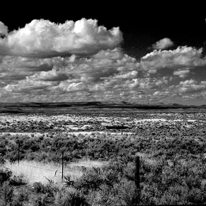
WesternGuy and Tight Knot; shot #2 composition is not harmed by the horizon in the middle, as there is pretty good artistic balance in the shot overall.

The main problem is lack of a well defined main subject.
 
Of the second set, I like the one on the bottom right with the yellow line mostly gone. I think there are enough "pointers' - the centre white line and the fence line on the left side - to take the viewer's eye to the clouds in the distance. Also, the contrast between the lighter foreground and the dark clouds in the distance is enough so that the clouds grab you eyes very easily. I think getting rid of the >>> sign helps a lot, but that is just me. Remember, you are the artist and what ever works for you is your choice - you cannot, nor should you, expect everyone to agree with how you present your image - there are "rules" of composition, but rules are meant to broken and should be, as and when appropriate.

TK, thanks for the offer on the two landscapes, but I prefer not to edit other folks images - my opinion on what is, or is not, good composition, is just that - my opinion. As I said, rules can be broken and the bottom line, or final image, is what ever works for you and if you like the composition as it is - then that is your decision as the artist.

WesternGuy

 
WesternGuy and Tight Knot; shot #2 composition is not harmed by the horizon in the middle, as there is pretty good artistic balance in the shot overall.

The main problem is lack of a well defined main subject.

Point taken.

WesternGuy
 

Create an account or login to comment

You must be a member in order to leave a comment

Create account

Create an account on our community. It's easy!

Log in

Already have an account? Log in here.

New Topics

Back
Top Bottom