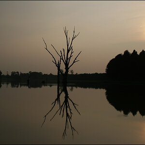
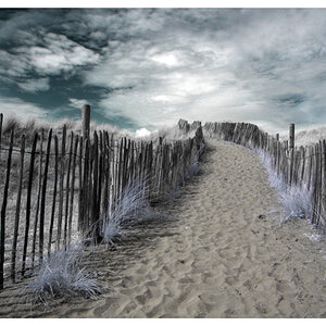
The way #1 and #3 are composed makes me want to look for symmetry where there isn't any. The point where the space between the buildings meets the horizon is smack dab in the center of the frame. There's no focal point. I like the colors and tonal range on #3 but the composition doesn't help this shot at all for me.
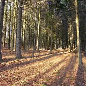
#2 could be cropped on the right to get rid of some of that empty space. Not all of it, but about half of it. Also, there's a bright reflection off of ONE car in the ferris wheel - you could try burning that a bit.
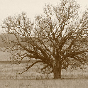
I'm not sure what to say about #4... doesn't really grab me at all.