This isn't doing much for me.
It strikes me as an exercise in formal composition, and as such it falls down pretty thoroughly!
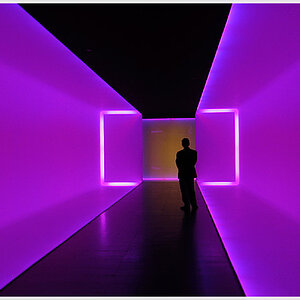
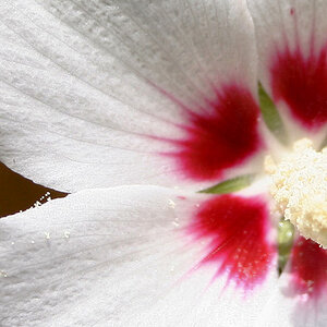
There's a nice gradation of tone from lower left to the brightest area upper right, but the black 25% or so of the frame on the right seems out of place (formally, I see what it is and why it's there as a picture of a thing, a scene, but as a formal composition it's wildly unbalancing). This creates a "highest contrast" area upper left there, where the brightest area meets the black area. This draws the eye, but there's nothing there. The interesting stuff is all in the middle-toned area in the middle, lower down.
If the scene were more obvious, if it were immediately clear what we're looking at, these formal qualities would not be such a problem, but as it is this is nearly an abstract.