Maastricht

Vautrin

No longer a newbie, moving up!
Joined
Jun 26, 2008
Messages
927
Reaction score
58
Location
It changes
Website
www.withoutamapphotography.com
Can others edit my Photos
Photos OK to edit
Please be brutal, I want some good C+C so I can improve.

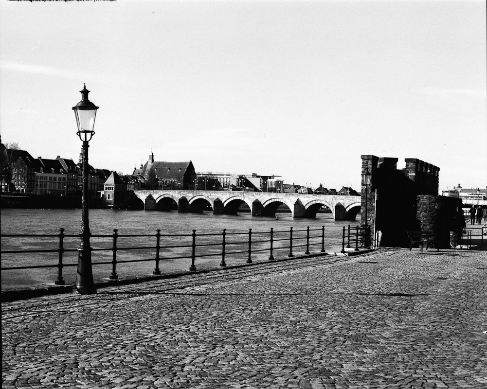
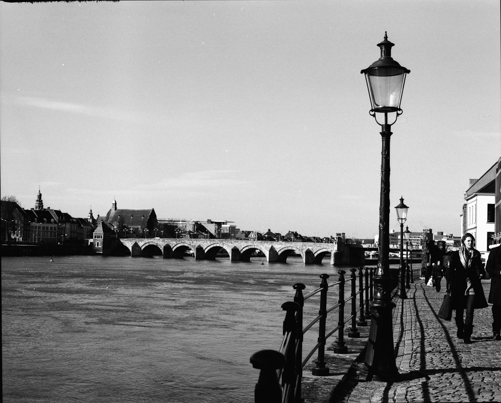
Which is better in terms of angle, shot 1 or 2?

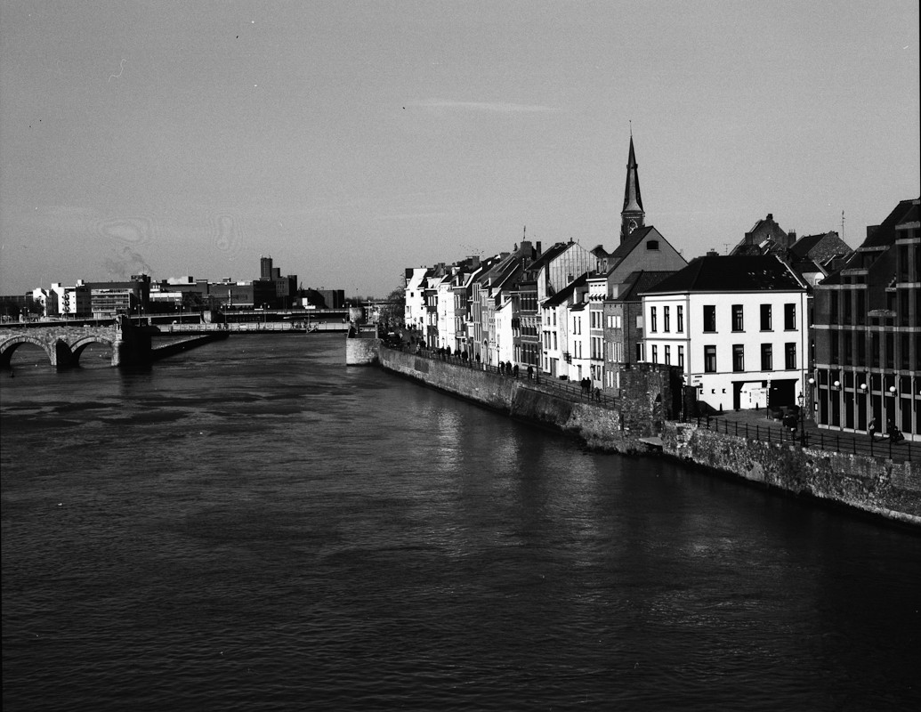
These shots done in Maastricht, Netherlands -- a little town in the south.

All done with a Mamiya RZ67 + 110mm lens, shot with Rollei Retro 400S:

1)
mamiya-bw-1.jpg

2)
mamiya-bw-2.jpg

3)
mamiya-bw-3.jpg
 
If you can straighten the horizon a bit I like #1 the best.

The sky looks like it could benefit from burning. I can see faint detail but I'd like to see more.

How did you develop the Rollei Retro? I've got several rolls that I'm waiting to run through my Mamiya and the Diana.
 
This was one of my first rolls with the Mamiya and it went through a photo lab in germany -- not sure what developers they used

I've actually developed quite a few rolls of the rollei retro through them and I have to say I love the stuff -- especially the one with infared sensitivity.

The sky I'm kind of sad to say doesn't really get burned the day was completely cloudless -- it just gets grayer... Might be worth retaking that shot on a day with some nice fluffy clouds and a dark red filter...
 
i like the second angle mainly because i like photos that have a repeating object, which in your case are the street lamps
 
^^ much better. The bridge being offkilter was distracting. Great image.
 
Nice pics, it look slike a very scenic spot. Now for my opinions:

The angle is better in shot 1. In the 2nd shot, I feel like I'm about to fall into the water - that rail splits the frame almost in the middle. On #1 I want there to be something more prominent in the foreground. You could move closer to the lamppost, but probably you would then lose that stone structure on the bank. Or maybe get down to make the pattern in the stone pavement a more noticeable part.

With B&W the sky is always an issue. You could use a yellow or red filter to darken the blue sky and make those wispy clouds stand out better.

I generally like the tonal range and contrast, with plenty of deep blacks, but maybe the stone structure on the bank needs a little more detail.
 

Most reactions

New Topics

Back
Top