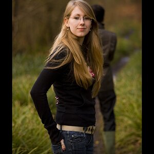
The eyes look too obviously edited for my taste, and the skin has a very unnatural smoothed out look to me in some spots that don't match other areas of her skin. Sorry, I'm too tired to give anything more in-depth than that.
I think it's quite lovely, myself. The catchlights in her eyes are a bit unsettling, but they seem to be just reflections of whatever was out there. I'm not seeing the skin smoothing that Dan is, but I could just be missing it.
The eyes do pop a bit, but I am willing to chalk that up to very narrow DoF and exact focus. It's at least credible as that. Possibly I have had my tastes dulled by endless pictures of babies with creepy oversharpened eyes, though.
The light is very very nice, albeit a bit cool. This actually has that "outdoors in Alaska" feel we've seen a bit of here, and I quite like the color palette that produces. It's not particularly flattering, nor does it meet with contemporary American Fashion Standards, but I don't care about those things. I think it looks lovely. The cool tones fit her expression here quite well, too.
Someone will no-doubt complain about raccoon eyes and tell you to place a reflector in front of her. I, however, will not, and disagree.
I see some small areas in the large version that might be less than perfect skin-smoothing, but they're VERY minor. I like the mood and style of this image very much.
I looked at the large-sized file on Flickr. There appears to be no skin smoothing at all, just areas where the depth of field doesn't cover small areas of the face. Otherwise, the pores and minor skin variations appear straight out of camera. Catchlights also appear to be natural, when seen large enough to "see". However, when reduced in size to TPF's dinky max size, the file's overall look is basically, destroyed.
My issue is that this is like the third vertical portrait you've posted within the past week with the subject awkwardly positioned well off to one side of the frame. This unbalanced, unsettling, off-centering of the subject looks very "affected", to put it politely. In this shot, the head-chop in favor of including more of the scoop necked T-shirt makes little sense to me. The majority of the things that make this shot are simple, and natural,like her simple hairstyle, simple makeup, and direct and "real"gaze.... and then there's a head-chop...it just doesn't work.
I viewed the original size image just now as well. While I agree that the small sized version makes the skin to appear to have much less detail than the original has, I still think it looks a bit more smooth than it naturally would be, or could be with more subtle retouching. I could be wrong, but this is just how the skin looks to me. Perhaps sharpening up the image a little with a duplicate layer that has had a high pass filter used on it and setting the layer mode to "soft light" would bring more sharpness of detail to the skin.
The eyes still look over-edited to me in the largest version as well. Perhaps it is just how her eyes are naturally, but it looks to me like parts of her iris have been dodged in photoshop to a point where it looks obvious and unnatural to me. If you did dodge or enhance this, my suggestion would be to tone it down a little bit. Subtleties in my opinion will always have a stronger affect on the image than something very obvious.
I'm not saying it's a bad image because there is a lot about it that I do like, just certain aspects of the editing that I think could be done better.


") just that i wished the focus were better on the eyes rather than on the nose area
just that i wished the focus were better on the eyes rather than on the nose area![[No title]](/data/xfmg/thumbnail/32/32930-09414fc020c2a60a456ff59a05c5ef8f.jpg?1619735759)
![[No title]](/data/xfmg/thumbnail/42/42493-2665d3a35f26795cc783aeb77329a032.jpg?1619740197)


![[No title]](/data/xfmg/thumbnail/34/34349-9e6dfcf7d5163c413329b9b4a5872791.jpg?1619736385)
![[No title]](/data/xfmg/thumbnail/32/32926-ec27ecead8c80d803404500d8f888dbf.jpg?1619735754)