What's new

Malchiore

DanOstergren30 5

"We're all mad here" ... At me?
Joined
Jun 2, 2013
Messages
5,279
Reaction score
5,171
Location
Oregon
Can others edit my Photos
Photos NOT OK to edit
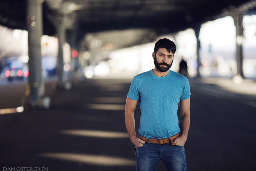
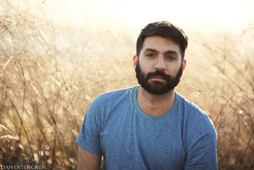
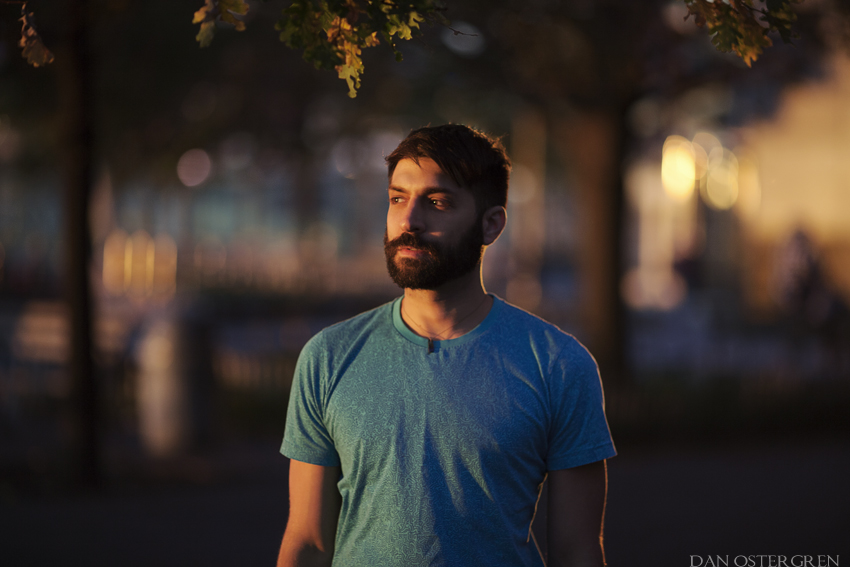
There's no deep meaning or artistic thought behind these photos. Malchiore is someone that I met that I'm starting to love quite a bit, and I wanted to share a couple portraits I shot of him. He gives me butterflies. Wishing I didn't cut the bottom of his sleeve off in the first image, and I had some difficulties toning down some of the saturation in the second image but figured I should leave it since that was the color of the natural light.
malchiore_by_danostergren-d6ut25d.jpg


malchiore_by_danostergren-d6ut3yb.jpg


mg_5042_by_danostergren-d6v8mlo.jpg
 
Wow, the light and colors in all of these images are beautiful. I love them.
 
Handsome dude, lovely images. Really nice light and pleasing characterization of your subject.
 
Oh and you could use some fill flash.


kidding!!!! :)
 
You do have a rare gift for exploiting ambient light Dan... very nicely done!
I used to use OCF exclusively until I had my entire gearbag stolen (they got both cameras I had at the time which were a 5D Classic and an XTi, an 85mm f/1.8 lens, a 35mm f/2 lens, a 135mm f/2 lens, and 3 580exII speedlites, as well as various filters and my passport) a week after moving to San Francisco. I could only afford to purchase a 50D and an 85mm f/1.8 lens to replace it all, and had to teach myself to use natural light as if it were a flash. Turns out I liked it better, lol.
 
Sexy guy!! You have great taste! :sexywink: You did a wonderful job with these shots!
 
-I like both of these shots for the same reasons the other commenters mentioned already. Though if I were to chose, I would say I like the first one more. The lighting, expression, the amount of the frame the subject takes, the background. Love it.
-The second image: I wish he had been slightly more to your right so his arm didn't have that light spot on the ground coming from his arm. The light spots on the ground make great lines, but it being cut off by him bothers me.
 
Number 1 is the clear winner for me. The way you've used/caught the light behind him on the grasses is really, really good. :D

Not sure about the grass heads that show against his T shirt photo left. As the rest of the stalk is virtually invisible they seem to be a little distracting to me.
 
I liked them all, but especially the last one. The background frames him and brings out more of the romance. The dark colors suit his dark features as well.
 

Create an account or login to comment

You must be a member in order to leave a comment

Create account

Create an account on our community. It's easy!

Log in

Already have an account? Log in here.

Back
Top Bottom