Markw
No longer a newbie, moving up!
- Joined
- Jul 25, 2008
- Messages
- 4,057
- Reaction score
- 230
- Location
- Baltimore
- Can others edit my Photos
- Photos NOT OK to edit
I think that most posters like to start their own threads and go from there. You ought to stop by more often and insert your critiques there!
Well, just to humor you a bit and spam the forums a bit more -_-:

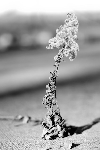
The perspective of this one really isn't all that appealing. It's kind of like you're saying "look how this here mountain zooms right down into that there ocean water" or something of the sort. The black and white conversion also may have been rethought. I really don't think it does the photo justice at all. The odd rock and flowers in the foreground are extremely distracting. A shot taken at a more level angle would have been more appropriate here. A wider angle would have helped as well. 3/10

Some people like this style of editing (if you edited it, and it's not a faulty photo). Indeed, it works for some, not for this. The subject, while interesting as far as trees go, really isn't being used well photographically. The muted colors and almost haze toward the top make it very unappealing. As does the clipping of the branches on the left and right. The subject isn't really all that interesting, without a complementary subject, that is. 1/10

Again, perspective is off. This subject is one that could actually have been cool, but the position from which you shot it was just not done well. The composition isn't great, there's entirely too much dead space. 4/10 for potential.
Have fun...
Do cell phone pics count? No. Thoughts on my friend Renee pic? It's completely irrelevant.


Okay, here are four images that should look okay on the web at the teensie-tiny size we're allowed here. Most of my web images are much larger than the allowed size here, and look like crap when re-sized and served by my host, which is pBase. All four of these were shot with my FujiFilm S2 Pro 6 megapixel camera.
photo 1--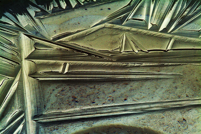
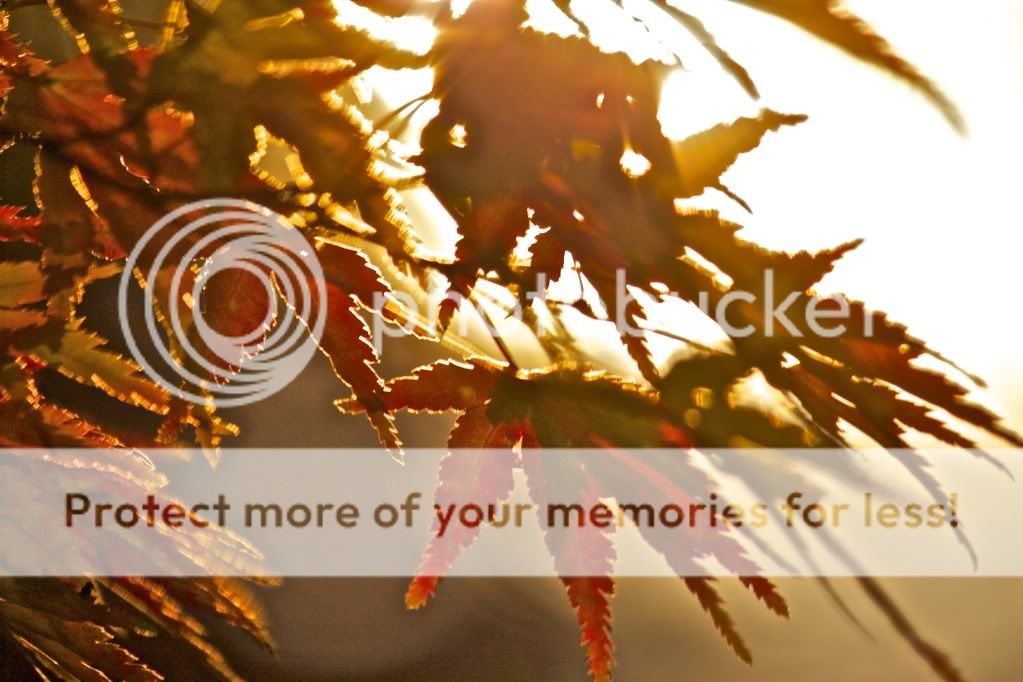
Sunrise Superman
This is an interesting subject. I can't quite tell what it is. But, beyond the mysteriousness of it, I think it loses it's appeal. Being so ambiguous, I'm having a bit of a hard time connecting to it in any way, and the blue/green color artifacts in the lower 1/3 are extremely distracting. 6/10
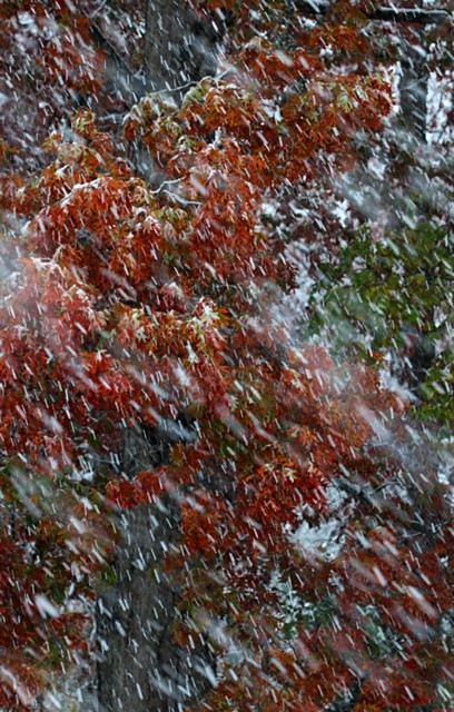
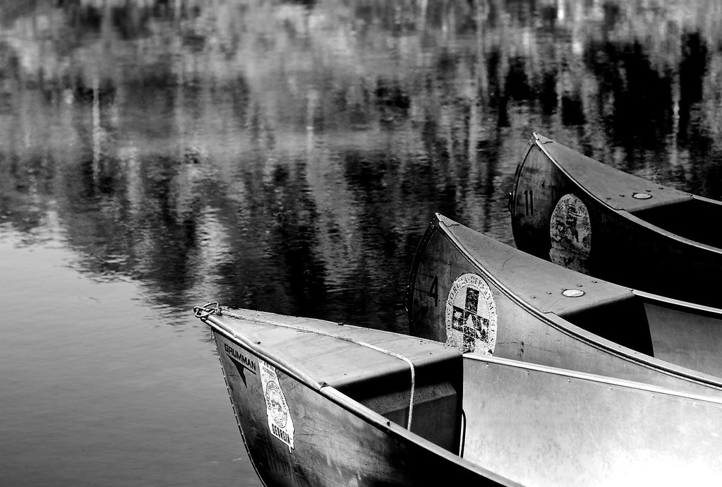
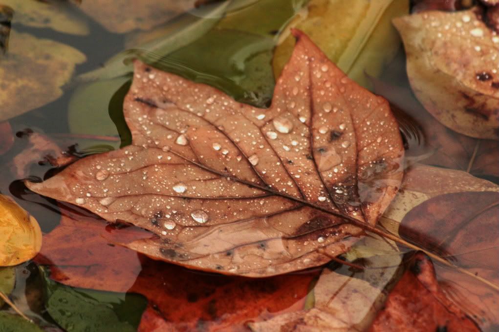
photo 2--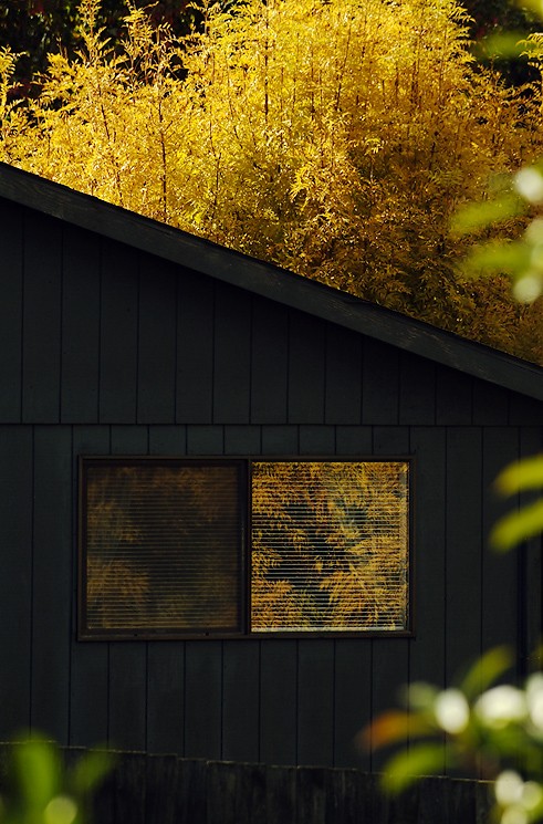
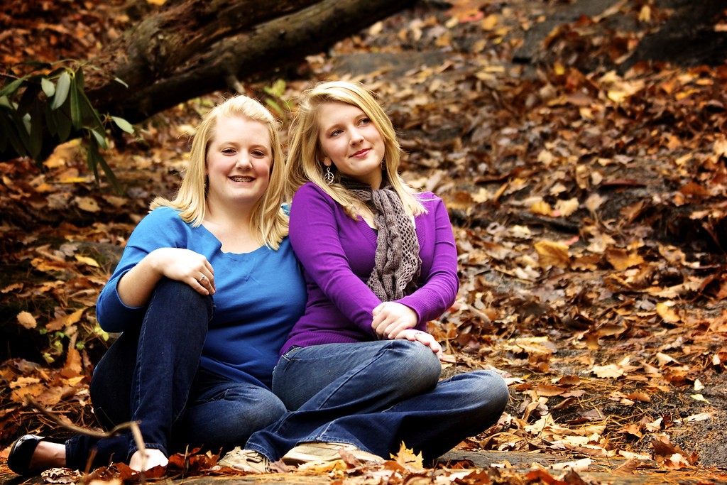
Reflected Fall
I'm not sure if I understand the title. But the colors of the foliage here are very nice. Exposure looks spot-on, but I don't really think there's enough of a prominent subject. The foliage in the foreground is extremely distracting, and I have a feeling you already knew all this. The foliage in the back really is a beautiful color, though. 6/10
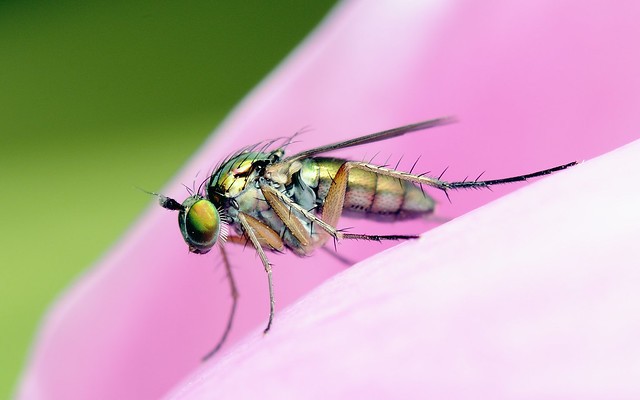
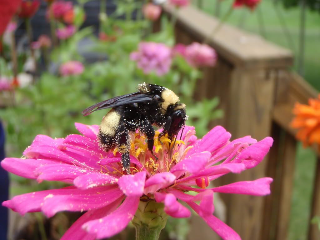
photo 3--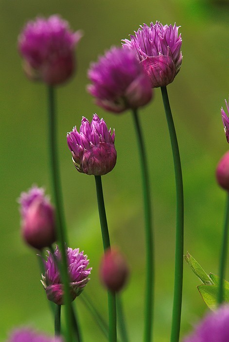
Chives
Are these really chives? They're quite beautiful. Great exposure. Spot-on focus, good natural framing. Beautiful colors as well! I quite enjoy this one. If I had to nitpick, the OOF flower above right of the subject bloom is slightly distracting because it intersects with the other in-focus flower. But, all in all, I like it. 8.5/10
photo 4--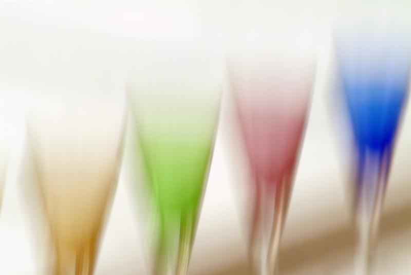
Whimsical Glass
I don't get these. I'm not one for interpretational art, or extremely blurred photos.
WOWA you got Derral posting pics!About time we saw more of them!
Also you know you can always show smaller pics and put direct links to bigger ones if you want to show them bigger
Dude...I've had over 3,200 pics posted and on-line for years...just click on my profile,and my link's been there since the very first day I showed up here, for those who care to see my pics...but who really cares about my photos man? It's all about the hobby, the enjoyment, the passion that comes from blowing all your spare money and time on shooting pictures...it doesn't matter if the photos or good or not...it's about the passion!
Oh, and Mark...what about "The only rule:
NO LINKS"
That's been revised. :mrgreen:
Yeah but showing things up in the forum is a great way to share the fun too
or have long raving arguments with people - whichever suits your fancy")
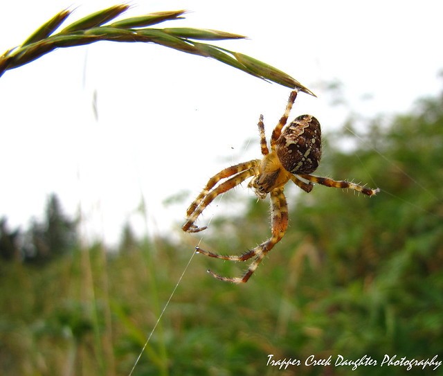
and eh I'll throw a pic up too even though I've really not got anything recent worth tearing into buut:

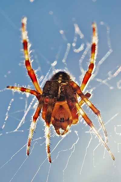
spider
Now, now now, my friend. You're quite the macro aficionado. We both know that. To be completely honest, though, this photo doesn't really do much for me. The focus is nice, but the perspective from above isn't appealing, And it's just a tad dark around his eyes. I've seen much better from you. :hugs: 4/10
EDIT: It also looks a little off-level. That could be easily adjusted, though. As we both know. :thumbsup: Extra point off.
​Messages in Red
Mark
Last edited:


![[No title]](/data/xfmg/thumbnail/37/37095-648a4e65f10e6fdeeb231be5ed8c3152.jpg?1734169827)


