Matthew | Senior Portrait | Need critique

Ironlegs

No longer a newbie, moving up!
Joined
Oct 7, 2013
Messages
198
Reaction score
67
Can others edit my Photos
Photos NOT OK to edit
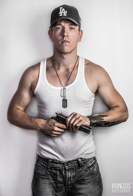
Hello, today i had a photoshoot of my best friend, we used airsoft guns ( they look like real )
I used 1 constant light from angle 45 with a piece of thin cloth over it as a diffuser, i left the shadows on purpose, i like shadows.

Thoughts ? Or any tips to improve my future photoshoots ? :)

1.
The Last Man Standing by Ironlegs Photography, on Flickr

2.
The Badass by Ironlegs Photography, on Flickr
 
Last edited:
I like. I like #1 better because the angle of the head in #2 somehow doesn't look as good as it could. I think it's the way the angle affects the eyes and the hat. I do like your processing and the shadows, particularly in #1, it suits the subject well. :D
 
I like #1 better also. Things to watch for/think about in the future? Think about the wall shadow. No shadow? Shadow from actually touching the wall? Or a shadow cast onto the wall? There are three options, each of which can look good if executed well.

More and more, there's a move toward having the subject literally touch the wall, and cast a strong shadow, and that can really give a nice 3-D effect. The old way was NO shadow, with a white backdrop well behind the subject, which lacks the 3-D effect, but is considered very "clean" by some people.
 
I blame Terry richarson for that.


Curious. Is this a senior that went back and got his ged at age 19-20?
 
Last edited:
For what it's worth; IMO this should have been shot with more "grunge", meaning lower light level overall, harsher light (gridded, or sharp cutoff), stronger shadows, and a different background.

Pose #1 is good, forget about pose #2.

Ask him to check/straighten his zipper.
 
I like the toning of him. It has a slightly hyper-realistic look that works for him. However, the one thing that is bugging me is the shadow on the wall. In the second it's not quite that bad since it covers a good portion of the wall, but in the first it creates kind of a dark halo around him that makes it look almost like he was composited onto the white wall.

Granted, depending on how much space you have to work with, it might be difficult to play around with subject-wall distance.
 
I like the first -
 
Having the shoulders square to the camera makes them look more like mug shots than senior photos.

I like the light quality but like shadow edges a bit more diffuse. We make shadow edges more diffuse by using a larger light modifier.
 
The only thing I don't like is that the shadow is on different sides in the two photos; I try to go for a cohesive flow to a photo set, and that just throws me off a little.

How old are you, and how long have you been shooting? Your work is excellent.
 
The only thing I don't like is that the shadow is on different sides in the two photos; I try to go for a cohesive flow to a photo set, and that just throws me off a little.

How old are you, and how long have you been shooting? Your work is excellent.

Wow thanks a lot ! I am 18 years old and on 5th october it was exactly 1 year of taking pictures. I know what do you mean by the shadows, i had a lot of trouble since i was in my quite small room and all i had was a portable white "wall" which is really narrow and one constant light.

I had to reposition it all infront of a window. In the first picture i have 2 light sources, 1. is a window right infront of the subject and 2. is the constant light again from 45 angle
 
Last edited:
Having the shoulders square to the camera makes them look more like mug shots than senior photos.

I like the light quality but like shadow edges a bit more diffuse. We make shadow edges more diffuse by using a larger light modifier.

I believe he wanted the "Gangsta" look and they achieved it. The photo is very well done, only one technical issue. Keep the finger off the trigger unless you are on target and willing to destroy it...

Yeah you are right and thanks for the tip :)

I added another picture, i went for a "game poster" look.
 

Most reactions

New Topics

Back
Top