What's new

mean old world

KenC

Been spending a lot of time on here!
Joined
Jan 18, 2010
Messages
5,699
Reaction score
1,472
Location
Philadelphia
Can others edit my Photos
Photos NOT OK to edit
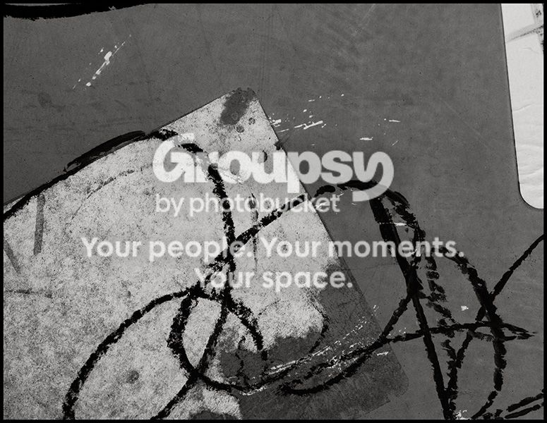
sign121412.jpg
 
Interesting. I have a fondness for these found abstracts. This one has some nice properties, in that there's a lot of "almost" in it -- the scribble is almost letters, so I wonder what it might say if I could see it all; the shape upper right might be a mirror, or it might be a part of a picture of something, so I can wonder what it reflects or depicts.

This sort of thing works best for me when it's triggering recognition cues, without quite letting me in on the secret.

Nicely done! Works for me!
 
Thanks Andrew. I'm glad you felt that you weren't getting enough information. I usually try to crop out parts of signs or other objects to leave the image open to interpretation.
 
Well... "I don't get it". So my suggestions may completely miss the point.

I'd probably crop out he scribble at the top as it doesn't add or even suggest anything. and the white thing top right, I'd either include more of it or less of it (as in move it out of the way before shooting), as the amount currently present looks more like a mistake than anything else.

Without the thing at the top and the top right, it seems a good abstract, especially w/ the white splotches breaking up the vast gray background.
 
nyc - as Andrew commented above, having partial objects in the frame leaves room for interpretation, or at least that's my version of what he said

shents - depressing is good - it's a pretty strong visceral reaction, and to me, if an image doesn't generate some kind of feeling, what's the point? And, yes, inward significance is the key, isn't it?

Thanks to both of you for commenting.

 
nyc - as Andrew commented above, having partial objects in the frame leaves room for interpretation, or at least that's my version of what he said

That can be true, but to me, in this particular example, they just look like careless composition. Maybe that's true, or maybe they were carefully considered and composed. But that's what happens when you leave the composition itself open to interpretation.

To me, the piece as a whole can be evokative... but the composition shouldn't be.
 
Nice conversion. I would rotate it 90 degrees counter-clockwise.
Then I would crop it to 5x7 aspect ratio and, in the process, lose the stuff at the top of the original version (which would be in the left side after rotating).
 
Nice conversion. I would rotate it 90 degrees counter-clockwise.
Then I would crop it to 5x7 aspect ratio and, in the process, lose the stuff at the top of the original version (which would be in the left side after rotating).

Thanks. The conversion was easy, as the background was a light orange color (newspaper box) so I just made that darker and didn't change the defaults much for the other colors.

I'll try the rotation - you may be on to something there. It's funny because a large majority of my images are vertical or square and this one was taken as a horizontal because that was the only option for getting this composition from the one place I could stand, but I never considered rotating it afterward. As for the stuff on top, I still like having it there, but I'll give that a look while I'm working with it. Thanks for the suggestions.
 

Create an account or login to comment

You must be a member in order to leave a comment

Create account

Create an account on our community. It's easy!

Log in

Already have an account? Log in here.

New Topics

Back
Top Bottom