What's new

Misc. Photos for Critique

DGMPhotography

Been spending a lot of time on here!
Joined
Mar 23, 2012
Messages
3,160
Reaction score
717
Can others edit my Photos
Photos OK to edit
Hey folks:

Here are some pictures I got while in DC.

Thoughts appreciated.

1. DSC_3375.webp
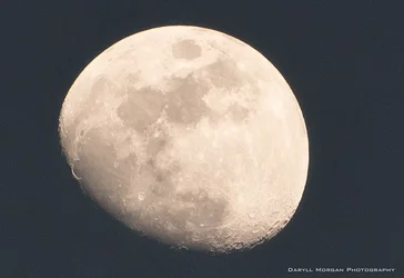
2. DSC_3376.webp
3. DSC_3380.webp
4. DSC_3383.webp
5. DSC_3386.webp
 
My first initial thought was...DC??? These could of been taken anywhere haha.

Nothing "screams" DC to me.

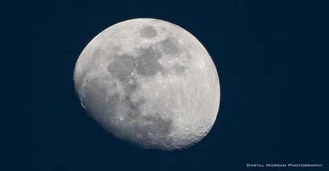
With that said, moon shots are tough to get unless you have reach, I like #2 with the slight blue hue to it.

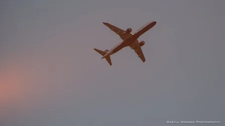
And #5 is nice with the cloudy flare in the bottom left.

All in all, I'm sure it was a nice trip :)
 
My first initial thought was...DC??? These could of been taken anywhere haha.

Nothing "screams" DC to me.

With that said, moon shots are tough to get unless you have reach, I like #2 with the slight blue hue to it.

And #5 is nice with the cloudy flare in the bottom left.

All in all, I'm sure it was a nice trip :)

Yeah, most of these could have been taken anywhere. But it just happened to be DC lol.

Thanks for your feedback.
 
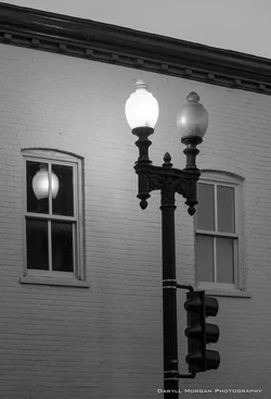
I like #3, nice use of black and white - the two lights, one lighted and one dark; same with the windows. And getting the reflection of the light in the window. Cool.
 
Both the moon shots seem to have a lot more image noise than they should.
What ISO setting did you use?

As bright and far away as the moon is you should be able to use your base ISO (100 or 200), as fast as 1/1000 for your shutter speed, and a wide open aperture.
Some Lunar Eclipse Composites
 
Both the moon shots seem to have a lot more image noise than they should.
What ISO setting did you use?

As bright and far away as the moon is you should be able to use your base ISO (100 or 200), as fast as 1/1000 for your shutter speed, and a wide open aperture.
Some Lunar Eclipse Composites

Well I still had to crop to a tiny portion of the original image which I'm sure didn't help. My settings were just about what you described, except for the aperture. For the first one, I was around f/2 and for the second one I went to about f/8.
 
C&C per request:

My first thought on all of these is that you've cropped to awkward ratios and generally too tightly, there's nothing else in the frame to give us any reference.

#1 and #2) First, kudos for trying moon shots, I haven't gotten any I like yet. The gibbous moon is, IMO, the least attractive perspective; when cropped this tightly, these shots seem to me to be more about the misshapen blob shape than about the moon. You might consider a square crop with a moderate amount of space around the moon (say, about how much you have to its sides in #2), with the actual center of the moon in the center of the frame (there will be more dead space to the bottom of the frame, which helps emphasize that part of the moon is hidden in shadow).

I do like the blue tint of #2. To stay strictly black and white in #1, I'd suggest upping the contrast until space actually looks black (or pretty darn close). My brain can comprehend a deep blue evening sky, it doesn't agree with a faded gray sky.

#3) This is an interesting capture, with the lit/dark/reflected streetlight elements. There are some things about the composition which could be improved upon.
-The unlit lamp and the stoplights are impinging on the right window. Had you moved to your right you probably could have still gotten the reflection of the lit lamp in the left window while getting some separation for the right window.
-Again, the crop is so tight that it doesn't put the scene in context. You've put the stoplights at the bottom of the frame, but since the viewer knows those are normally higher up than eye level you've grounded the image in a way that we instinctualy know is off.
-You have the dark band of the roof line leading to the corner of the image. This roof line and the light pole stand out from the rest of the image's tones, and because of its angle the roof line actually appears more dynamic and begs for more attention than I expect you intended. By leading our eye right to the corner (rather than off the top or part way down the side), it seems you are giving some importance to that leading angle.

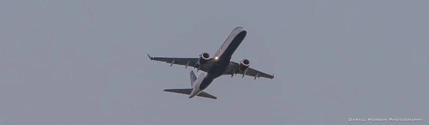
#4) This is a decent perspective of the airplane, but you lose any story by the super tight crop top and bottom. I would suggest cropping so that the plane is down in the lower left quadrant of a wider crop, so that it appears to have space to fly into.

#5) While the "rule" is to have your subject facing toward the center of the frame (as I suggest for #4), that is a rule which can be broken to good effect, and this is one such case. I like the tint in the sky behind the plane, as though the story you're telling here is that it is leaving something behind. I'd still suggest a bit of a wider crop, particularly with some more room at the top of the frame.
 

Create an account or login to comment

You must be a member in order to leave a comment

Create account

Create an account on our community. It's easy!

Log in

Already have an account? Log in here.

Back
Top Bottom