Frequency
Been spending a lot of time on here!
- Joined
- Oct 17, 2010
- Messages
- 8,864
- Reaction score
- 683
- Location
- Calicut, Kerala,India
- Can others edit my Photos
- Photos OK to edit
Mish-match  or Mismatch
  ?
?
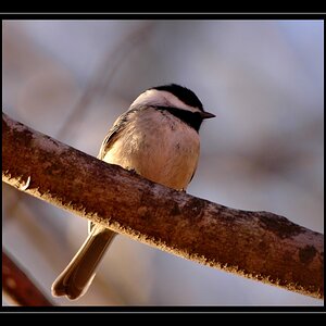
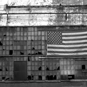
This is inspired by Mishele's work ...like a dew drop's attempt to reflect the whole Universe around
C&C please
#!
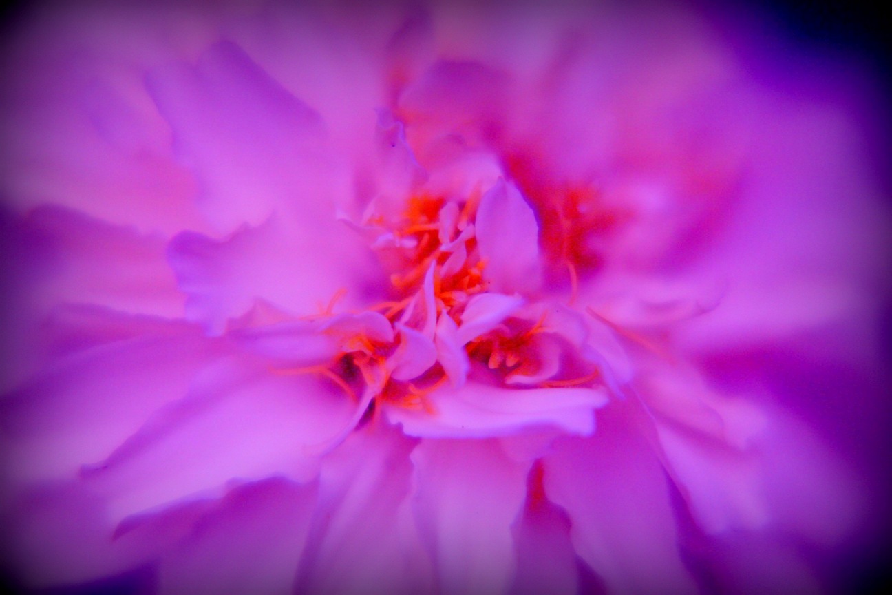
#2
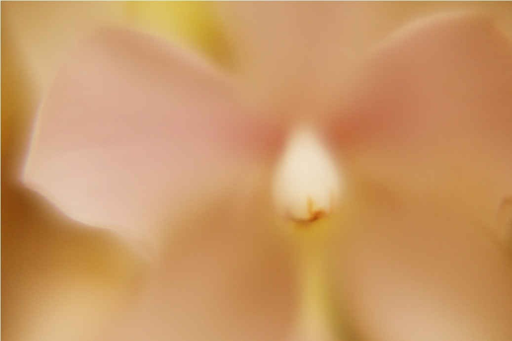
#3

Regards
or Mismatch ?This is inspired by Mishele's work ...like a dew drop's attempt to reflect the whole Universe around
C&C please
#!
#2
#3
Regards



![[No title]](/data/xfmg/thumbnail/31/31980-e5048a424621c7b3cd0d306d63c09d67.jpg?1734160756)