Mom & Baby

LizzyQ

TPF Noob!
Joined
Mar 19, 2008
Messages
46
Reaction score
0
Location
Utah
Can others edit my Photos
Photos OK to edit
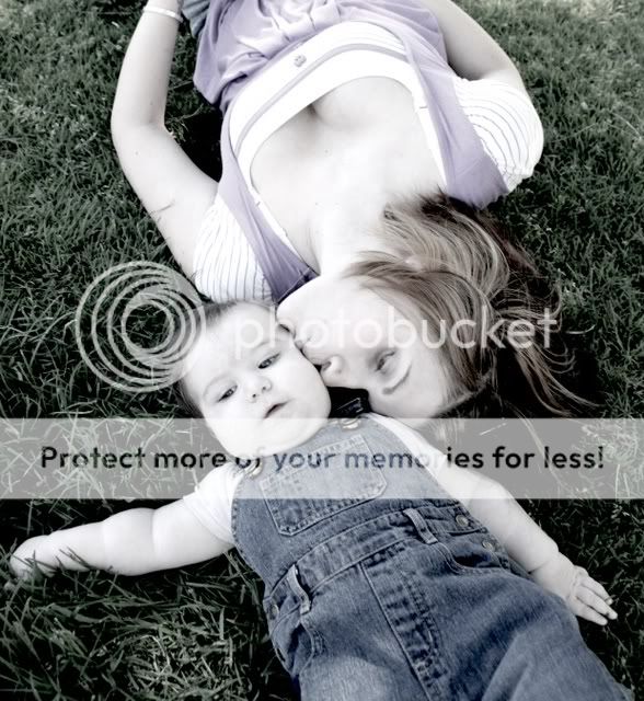
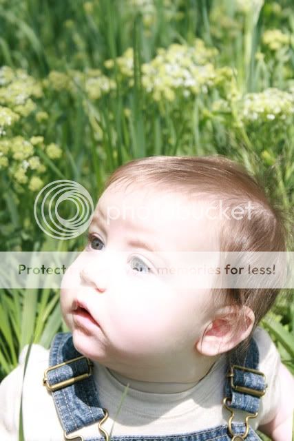
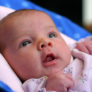
Did some photos for a friend of mine and her baby..

1.
IMG_3355-2.jpg


2.
IMG_3354-2.jpg


3.
IMG_3369.jpg


4.
IMG_3387.jpg


5.
IMG_3376.jpg


6.
IMG_3481.jpg


7.
IMG_3381.jpg


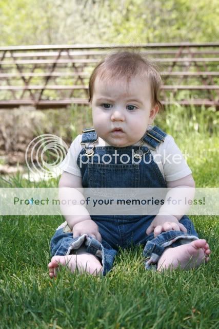
I really like the ones with the 2 of them together, but I don't know that I am crazy about any of the ones by himself.
 
I'd really love to get some C&C ;)
 
I think the desaturation in #1 works against the photo. I like to desaturate images a lot, but, for lack of a better phrase, #1 looks very corpse-like.

The second one seems a bit out of focus, but beyond that, I think the image itself suffers because it's not centered across the vertical. If they were entirely in frame (head to toe) it might have worked, but I'm not sure. It's hard to figure out where to focus in that picture -- my eye was drawn everywhere.

I like #3, my only complaint being that there should be either more (the feet) or less (around the middle) of the baby. I think this image could be sharper as it seems a little soft. Overall, I think this one has the best composition of the two of them together and the colors really work.

#4 might benefit from a vertical crop where his head is in the top 3rd or so (or as close as it can be without cutting out the arms). The background is blown out and not in a good way. The capture, though, is amazing. That's a face a baby makes. The drool(?) on his chin and that war-wound on his neck could be cloned out. The low-to-the-ground shot works really well, I think.

The background in #5 is sharp enough that you lose track of the child in the picture. I think forcing him further to the lower right (maybe just a bit) might remedy, but lack of bokeh I think hurts this image. This one too appears a bit soft. On the flip side, the expression and your capture of it are very nice and natural.

#6 has an overexposure problem, especially on the face, and a framing problem with too much negative space above his head. I think this is the weakest photo of the batch.

Although #7 does have some exposure problems, I think this is the best photo you've got here. 2 suggestions -- crop it a bit tighter and reel in the highs and lows in levels and blend the midpoint one way or the other until this image gets a bit richer.

Here's a pass I did on the last image with the following -- levels change (brought in high and low and moved mid left a touch), ran a small sharpen pass, highlighted some of the highlights on his face and arms and brought those to a new layer, blurred then blended them back with a multiply, then ran a 50% overlay pass and dodged the eyes just a smidge. I took in the crop a bit, de-emphasized the color underneath his eyes and the shadows around his nose:

lizzy_q_edited.jpg
 
Rufus- Thanks for the C&C. I like what you did to 7. I am still learning PS stuff.. so I am not that great at post processing stuff yet.
 

Most reactions

New Topics

Back
Top