What's new

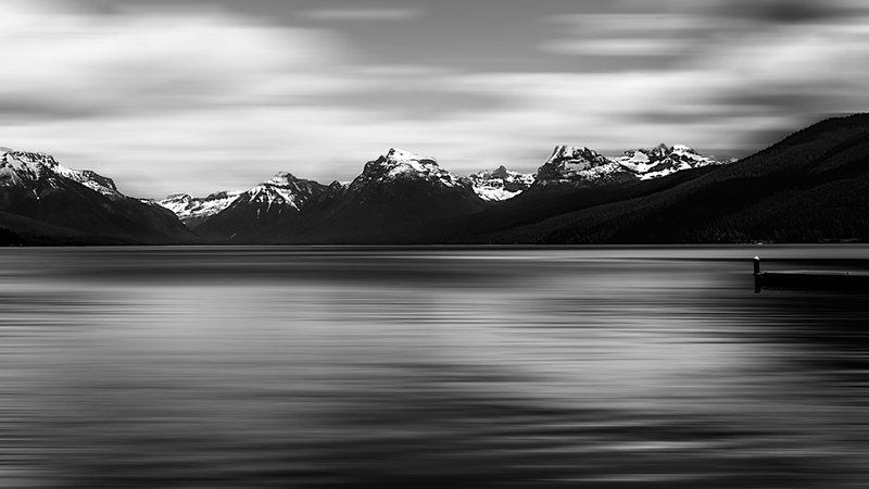
Monochrome Mountians - Glacier National Park

Very nice lake, the mountains lost something from the contrast and the sky to. How long was this exposure ? around 30 sec ?
 
I think the mountains were 13 miles away and that's why they lost contrast. I could be wrong. 45 Sec expsosure.
 
I can't fully get behind this shot. The effect of the water is too distracting. I also think you need to decide which should be most prominent - sky or water - and crop accordingly. Having it split down the middle does not work here in my opinion.


i-3FfRgFD-L.jpg
 
Last edited:
Sleist, can you now trim the sky a bit ? I think lake looks better.
 
Sleist, can you now trim the sky a bit ? I think lake looks better.


Hehe ... Could have predicted that. Was trying to be consistent with my lake comment so chose the sky as an example. The lake is less intrusive as the dominant feature - a bit counter intuitive.

i-nvCvDq3-L.jpg
 
I think it works as a semi-abstract, with the two areas balanced. It looks a bit like a butterfly if you squint. This is one of those things where desire to make it look like a traditional landscape, and to place in balance "things" and "subjects" conflicts with desirable graphical properties.
 
I think it works as a semi-abstract, with the two areas balanced. It looks a bit like a butterfly if you squint. This is one of those things where desire to make it look like a traditional landscape, and to place in balance "things" and "subjects" conflicts with desirable graphical properties.

Interesting. Despite the "balance" you see in the original, I find it uncomfortable to look at - "out of balance" as a result of tension between the top and bottom of the frame.
My eyes don't know where to go and bounce from sky to lake and back. This is why I suggested a crop.
 
I love the original. I don't have a problem w/ balance.
In fact....... December 2012 - Photo of the Month Nomination
 
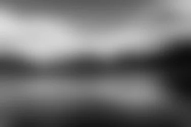
By "balance" I am referring to purely the graphical elements, distilled down to perhaps this:

$foo.webp

which I think you'll agree is pretty well balanced by the symmetry. As soon as you start putting recognizable things in there then you start wanting to show which ones are more important, and what the picture is "about". As a pure graphic, though, the image begins to suffer as you make these choices. There's an interesting tension in the way one makes these things.
 
By "balance" I am referring to purely the graphical elements, distilled down to perhaps this:

View attachment 29774

which I think you'll agree is pretty well balanced by the symmetry. As soon as you start putting recognizable things in there then you start wanting to show which ones are more important, and what the picture is "about". As a pure graphic, though, the image begins to suffer as you make these choices. There's an interesting tension in the way one makes these things.
Interesting. I am doing this with just my eyes (from prints).
 
There's some interesting research that was cited on TPR recently that suggests that out visual processing is actually built largely on these "low spatial frequency" images from the real world. We see, essentially, the image I posted first, and begin to chew on it before the details filter in. I'm not sure how this affects how we see photographs, but I know that I am usually conscious of the "low spatial frequency" component of an image. Possibly more than normal people? I don't know.
 
I am composing my takes based on proportions and configuration of low and high areas. Usually I "de-focus" my eyes to feel exactly what you did to that picture plus mentally add the influance of a filter. Well, not always works in final print with details, but I am trying.
 
Thank you for the advice! I agree that the lake is a less intrusive feature so I did slightly crop more of the sky out bringing it to a 16x9 ration. I also thought the mountains needed some more contrast to try and bring them out more.


I think it looks better viewed on black --> Tim Grey Photography - timgreyphotography's Photos


IMG_0009-B%26W-2-XL.png
 
I like it in this form much better.
 

Create an account or login to comment

You must be a member in order to leave a comment

Create account

Create an account on our community. It's easy!

Log in

Already have an account? Log in here.

New Topics

Back
Top Bottom