What's new

More CC Please

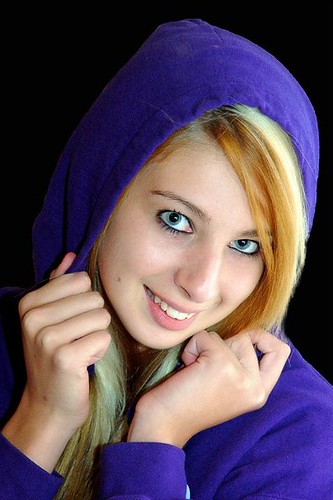
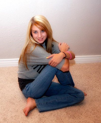
Problem with #2 on the lighting hot spots on the wall and on the top of her head...I like how you are approaching things though...

What is the PP process that you utilize for your work. The effects are clear and colorful and sharp, maybe too sharp and colorized and maybe not, but there is something that is interesting to me in your end result.

What are you shooting with?
 
I like number one but the light does his the top of the head on number two. Try that shot again but get closer to the floor.
 
Lovely model.

While you have created some nice visual lines with the posing, the are a few things of note IMO that you may not have considered.

The hand position in #1 is much better geared for the female model. #2 has the back of the hand mostly towards the camera which make them look larger than they surely are. A more feminie position is to have them in profile or closely. Meaning that the thinner edge of the hand is favorable. However, in both images she seems to receed into shyness by having a closed posture.

The tilt of the shoulders in #1 is spot on. This pose creates a much more dynamic visual than the typical "football shoulders" (square to the lens).

In a tight crop (#1), don't be afraid an even closer crop by having the eyes in one of the power positions of the ROT guidelines. This may mean to have the top of the head out of the frame. I do not have an issue with this type of framing if it looks purposeful. Experience will be your guide.

If you have a chance to shoot something similar as in #2, try lowering your camera position slightly. Even with her smile, this seems to be a domineering position. I would also suggest to have her open her right shoulder to have a 30-45° to the lens axis. Then place her hand (with the back edge towards the camera) on mid-thigh. Another little trick is to have her place her weight onto her hip rather than sitting flat on her bottom.

Both images look as if lighting was mainly from the built-in flash. Rather flat without any modeling (shadows) and #2 suffers from the camera rotated into portrait position and the flash throwing a shadow against the background camera right. Move the model further from the background to combat this. Also, avoid backgrounds that will bisect your subject (baseboard).

You've done well, just a few things that I see. YMMV.

Thanks for sharing.

 
The eye whites are un-naturally bright.

Tone down the editing some. There are parts of her hair that are green in #1.
 
#1 would be nice without the green hair, #2 would be better without that real bright spot by the top of her head but that one is the better of the 2. Good Job and keep up the nice work
 
kundalini said:
Lovely model.

While you have created some nice visual lines with the posing, the are a few things of note IMO that you may not have considered.

The hand position in #1 is much better geared for the female model. #2 has the back of the hand mostly towards the camera which make them look larger than they surely are. A more feminie position is to have them in profile or closely. Meaning that the thinner edge of the hand is favorable. However, in both images she seems to receed into shyness by having a closed posture.

The tilt of the shoulders in #1 is spot on. This pose creates a much more dynamic visual than the typical "football shoulders" (square to the lens).

In a tight crop (#1), don't be afraid an even closer crop by having the eyes in one of the power positions of the ROT guidelines. This may mean to have the top of the head out of the frame. I do not have an issue with this type of framing if it looks purposeful. Experience will be your guide.

If you have a chance to shoot something similar as in #2, try lowering your camera position slightly. Even with her smile, this seems to be a domineering position. I would also suggest to have her open her right shoulder to have a 30-45° to the lens axis. Then place her hand (with the back edge towards the camera) on mid-thigh. Another little trick is to have her place her weight onto her hip rather than sitting flat on her bottom.

Both images look as if lighting was mainly from the built-in flash. Rather flat without any modeling (shadows) and #2 suffers from the camera rotated into portrait position and the flash throwing a shadow against the background camera right. Move the model further from the background to combat this. Also, avoid backgrounds that will bisect your subject (baseboard).

You've done well, just a few things that I see. YMMV.

Thanks for sharing.

Thanks for the awesome tips. I was use ny speedlight which I was bouncing of different walls trying to get it right.
 
GeorgieGirl said:
Problem with #2 on the lighting hot spots on the wall and on the top of her head...I like how you are approaching things though...

What is the PP process that you utilize for your work. The effects are clear and colorful and sharp, maybe too sharp and colorized and maybe not, but there is something that is interesting to me in your end result.

What are you shooting with?[/

I am shooting with a NIKON d50 and a NIKON speedlight. I honestly can't remember what all I did with the edit I will post the sooc when I get home....
 
Both photos have some hot spots... I would research a little about lighting setups.

The other main problem is the backgrounds. In the first picture you really need a rim light to make the subject "pop" off that black background, especially with that purple hoodie that is very dark in it's shadow. The second picture is just a snapshot.
 

Create an account or login to comment

You must be a member in order to leave a comment

Create account

Create an account on our community. It's easy!

Log in

Already have an account? Log in here.

New Topics

Back
Top Bottom