C & C per request:
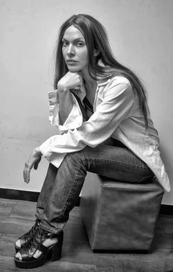
(5560a) Honestly, I'd scrap this one. The pose doesn't do anything for me, nor does it accentuate anything about her. She's making eye contact with the camera, but that's about the only positive thing I can say about her expression. I don't like the tilt to the image, it feels like she is on the deck of a ship and about to slide off to the right. There also appear to be some smudges on the wall (to the left of her lower hand) which I would clean up if I were keeping the image.
This is a fine time to ask what you are using to edit the images (you wrote that you "had a little time to work on these"). It's tough to tell if Lightroom would be beneficial without knowing what to compare it to. For example, on these smudges, I don't know that Lightroom would clean them up, but it's a quick fix in Photoshop.
(33) What jumps out at me is the over-the-top vignette, and I really don't think it helps this image. Beyond that I think it's almost there to being a nice shot. I like the color palette, the yellow wall works very well with the blue jeans, white shirt, and red hair. I find the pose somewhat interesting, very symmetric except for the crossed legs (which I like). In a shot so close to symmetric I would try to pay a little more attention to the details of symmetry. For example, have her hands at the same height, with the fingers spread the same way. This repositioning will probably also move her right hand out, making it easier to get a symmetric crop (the centerline of her body on the centerline of the image and the same amount of dead space between each hand and the edge of the frame). I'd also either try to get her hair to fall symmetrically (particularly with her part-down-the-middle hairdo) or really accentuate an asymmetric style by pulling much more to hang down in front on one side.
(61) I've already commented on the color palette (plus here you have the red stool, which also works). I kind of like the pose, though I wish she had turned just her eyes to be looking at the camera. I think the shot is a bit hot and would benefit from bringing down the exposure a touch (yes, something the Lightroom could help with). It's tough to tell whether you've nailed the focus on her eyes or if her lips are sharper. In general I often like a shallow depth of field - on this particular shot, I think going with a deeper focus would be beneficial. The bra she is wearing has those added interwoven straps to give it some real interest. When her face isn't bringing the intensity to make a statement in the shot, the let bra carry some of the weight of making this an interesting image. (Note that I wouldn't be saying this if she were wearing a boring, standard bra.)
(88) This is, IMO, the second strongest shot of the set. It's also a bit too hot, you're losing detail in her shirt, hand, and cheek. But I like the pose and the perspective from which you shot, and I like her interaction with the camera. Her face appears well centered horizontally, but with the tilt to her head and the body position weighting the image to the right side of the frame you get some very appropriate dead space to the left. As in the first shot you appear to have some smudging on the wall to the left of her, but since you also have texture above her I don't mind it in this shot (actually, I think it works better than a smooth, clean wall would).
(124) This, IMO, is the keeper of the batch. I like the pose, that her body is slightly turned out of frame to the short side while her head is looking through the frame to the left. I like that her front foot is very straight to the camera, that accentuates the angle that her rear foot (and the rest of her body, for that matter) is at. I don't even really mind that the bottom of the wall is at an angle, and I'm usually a stickler for keeping that level. About the only criticism I can give here is to keep an eye on her hair, it's starting to get unruly. Not too many flyaways (as in some of the other shots), but for her particular look I'd suggest either keeping her hair under control or really going wild with it.
Thanks for sharing!









![[No title]](/data/xfmg/thumbnail/37/37114-2bba6b6cc4df1fe53588503fb35af8dd.jpg?1734169831)