Sometimes you need to show less to see more

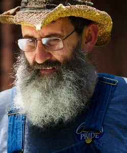
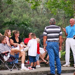
I can share my line of thought behind this edit. When you see an interesting character you often want to focus on his face and his eyes. This is often the case with charismatic older people and it is certainly the case here. The fact that he does not look into the camera is not a problem. The promblem is when you can not see his eyes close enough. So a closer view will help.
There is always some dominant mood in a good portrait, or at least should be, and it is always worth to look closer and try to see and extract this meaning if at all possible. What this portrait is about? Is this the photo of the neighbour? No, not at all. I say no, because that would be true if it was a passport photo.
This should be an image that tells us more about the man than a passport photo usually does. What do we want it to tell us?
This man makes answering to this question easy by wearing a "Pride" logo. So lets pretend that if it is here, it is here for a purpose. Lets extract some meaning from it! First we need to make the badge more visible. How do we do it? Lets remove all the clatter and unnessessary details in the low end of the frame. We need to have only one button there that attracts the attention to the badge.
So the line of vision here will be his face first, his beard, then the viewer looks down - and there is only one thing to see there - the button and "Pride" logo. The viewer reads the word and wants to look up again, to see the man's eyes and to read the same word in his eyes. Let him do it.
How do we do it? We make them closer, place them strategically in the frame and remove all the unessessary clatter and those details that contradict the character. The top of the hat in my opinion is funny and does not really complement the mood that I am trying to achieve here.
So the top of the hat goes, we loose it, but we gain some other beautiful stuff, like the rough fabric, the more accentuated curved edge of the brim and tiny sun rays penetrating the brim. I would have never noticed it, if it was not close enough. The funny shape would have dominated the details, projecting a completely different mood. Now these details are more accentuated.
You could also work with contrast and unsharp mask to enchance these effects.
In essence it is just a simple crop, but in my view it gives the image a completely different look.



![[No title]](/data/xfmg/thumbnail/37/37604-7ad625e983f92f880eb65a264eeef5e4.jpg?1734170732)
![[No title]](/data/xfmg/thumbnail/37/37606-3c9ffb5906173fa2aa489341967e1468.jpg?1734170733)
![[No title]](/data/xfmg/thumbnail/37/37602-1ef8dbb1c2d0e4ff347ee65d328c3603.jpg?1734170730)