deeky
No longer a newbie, moving up!
- Joined
- Jun 22, 2012
- Messages
- 1,244
- Reaction score
- 415
- Location
- Sioux Falls, SD
- Can others edit my Photos
- Photos NOT OK to edit
Played with a flower from my daughter's birthday.
As always, comments welcome.
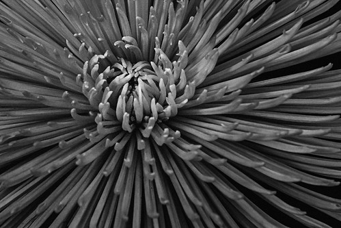
IMG_6287b by breckmiller, on Flickr
As always, comments welcome.
IMG_6287b by breckmiller, on Flickr


![[No title]](/data/xfmg/thumbnail/32/32178-010a47bfeb945bdafb02b0ee4888290c.jpg?1734161047)

![[No title]](/data/xfmg/thumbnail/31/31709-79016edd1a9f5ea41ef60f546bd0236d.jpg?1734160386)
![[No title]](/data/xfmg/thumbnail/32/32175-dfc7c053c145a53c7f2585ca44f122d4.jpg?1734161047)