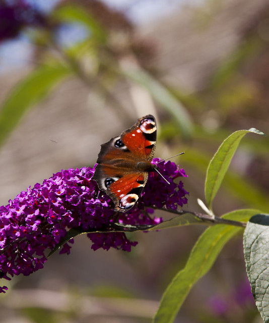
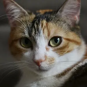
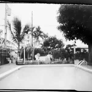
The first is nice but consider the whole picture instead of just the subject. The flower is cut off and I would have thought that horizontal format would have worked better here.
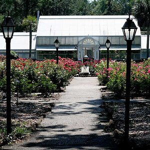
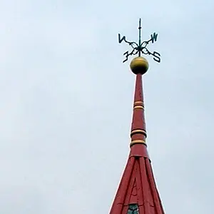
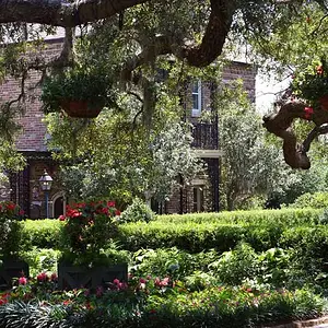
Second just doesn't have much interest and the lighting isn't working.
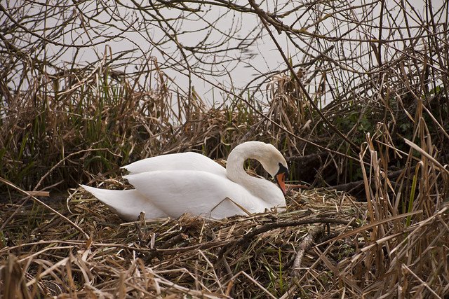
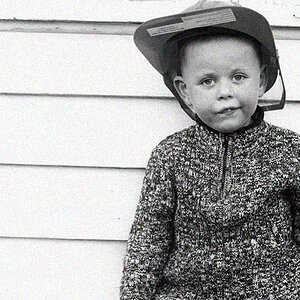
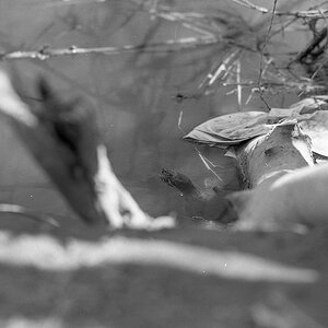
The third looks good again but I think putting the swan in the lower left third would have made for a nice composition.
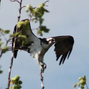
The only one that caught my eye was #3 I love the way the swan is framed by the brush I think all you need is slight cropping and some color and level adjustments.