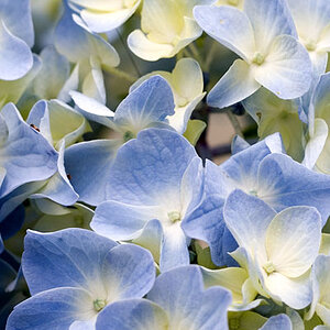
avpixlz TPF Noob! Joined Dec 10, 2007 Messages 9 Reaction score 0 Location Augusta, Ga itll i go back to Tx Can others edit my Photos Photos OK to edit Apr 21, 2008 #1 Criticism welcome.... http://farm3.static.flickr.com/2270/2372691856_80dcc073d7_b.jpg
Harmony TPF Noob! Joined May 19, 2007 Messages 1,377 Reaction score 0 Location Vancouver Can others edit my Photos Photos NOT OK to edit Apr 21, 2008 #2 I really like the composition and would love to see it posted without the crazy colours.
avpixlz TPF Noob! Joined Dec 10, 2007 Messages 9 Reaction score 0 Location Augusta, Ga itll i go back to Tx Can others edit my Photos Photos OK to edit Apr 21, 2008 Thread Starter 🔹 #3 Harmony said: I really like the composition and would love to see it posted without the crazy colours. Click to expand... Thanks and here it is... http://farm3.static.flickr.com/2071/2370223238_68fe996f77_b.jpg
Harmony said: I really like the composition and would love to see it posted without the crazy colours. Click to expand... Thanks and here it is... http://farm3.static.flickr.com/2071/2370223238_68fe996f77_b.jpg
J Jeffrsx231 TPF Noob! Joined Apr 15, 2008 Messages 14 Reaction score 0 Location Bay Area, CA Can others edit my Photos Photos OK to edit Apr 22, 2008 #4 I like that one much more the first one is way too saturated. nice shot
Coldow91 TPF Noob! Joined Sep 14, 2007 Messages 1,370 Reaction score 0 Location USA Can others edit my Photos Photos OK to edit Apr 22, 2008 #5 the second version is ace!
avpixlz TPF Noob! Joined Dec 10, 2007 Messages 9 Reaction score 0 Location Augusta, Ga itll i go back to Tx Can others edit my Photos Photos OK to edit Apr 24, 2008 Thread Starter 🔹 #6 thanks for the advice...
Sarah23 TPF Noob! Joined Mar 3, 2008 Messages 716 Reaction score 0 Location Oklahoma Can others edit my Photos Photos NOT OK to edit Apr 24, 2008 #7 ya...the first is way too saturated. I like the 2nd a lot more
soul.glo TPF Noob! Joined Apr 22, 2008 Messages 307 Reaction score 0 Location Honolulu Can others edit my Photos Photos NOT OK to edit Apr 24, 2008 #8 I'm going to have to agree with the others on this one. 2nd is much better. Nice work.
DRoberts TPF Noob! Joined Apr 18, 2008 Messages 779 Reaction score 3 Location Springfield, Missouri Can others edit my Photos Photos OK to edit Apr 24, 2008 #9 I agree. 2nd one much better. That would make a killer jig saw puzzle.
BoblyBill TPF Noob! Joined Oct 30, 2006 Messages 2,860 Reaction score 41 Location in the eye of a tornado Can others edit my Photos Photos OK to edit Apr 24, 2008 #10 I would still tone down the saturation... but that's just me.
avpixlz TPF Noob! Joined Dec 10, 2007 Messages 9 Reaction score 0 Location Augusta, Ga itll i go back to Tx Can others edit my Photos Photos OK to edit May 8, 2008 Thread Starter 🔹 #11 thanks again for the advice I'll do some editing...




![[No title]](/data/xfmg/thumbnail/34/34069-7b423c5bb5d324f4d924cf839cc122b3.jpg?1734164502)
![[No title]](/data/xfmg/thumbnail/42/42473-acff07bd005ae1bb1af25d5d00d0c437.jpg?1734177002)
![[No title]](/data/xfmg/thumbnail/42/42474-aa3cf1f7163a823d6f10558b262a4bc3.jpg?1734177002)
