

kevinglover
TPF Noob!
- Joined
- Dec 20, 2012
- Messages
- 46
- Reaction score
- 3
- Can others edit my Photos
- Photos OK to edit
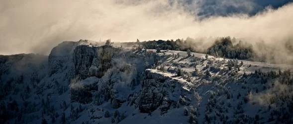
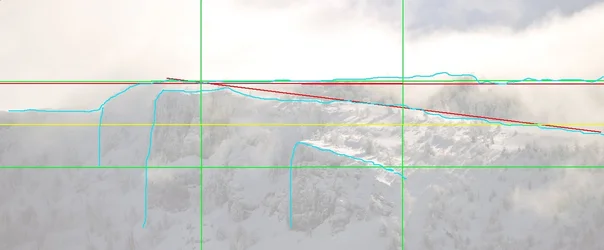
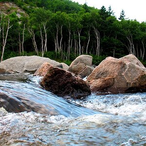
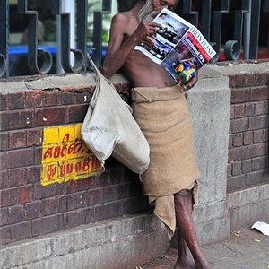
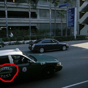
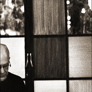
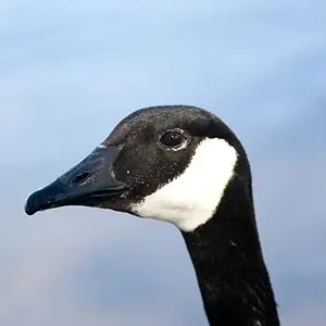
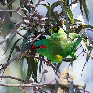
I'd love to hear some feedback on this shot! I think I like the 2nd version better. Less wintery, but more distinct.
Thanks guys
Kevin
Shot 1:
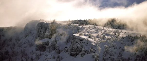
Shot 2:
Thanks guys
Kevin
Shot 1:
Shot 2:
Last edited:





![[No title]](/data/xfmg/thumbnail/37/37111-64f64f2c8371420041bf39244ff12117.jpg?1734169830)
![[No title]](/data/xfmg/thumbnail/37/37114-2bba6b6cc4df1fe53588503fb35af8dd.jpg?1734169831)

![[No title]](/data/xfmg/thumbnail/37/37112-9474bbad05f760cbef79df3379b23509.jpg?1734169831)