first off, id suggest posting less images to get more response from people
")
1- not liking the composition on this. having part of the cup on the lower middle of the frame isnt nice and feels too tight
look into the rules of thirds for composition ideas
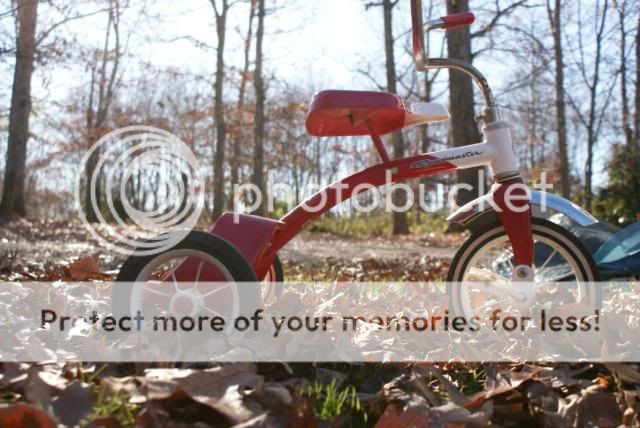
2- nice choice of shooting angle, but the bike looks under exposed while the background sky is totally blown out. were you shooting at mid-day or with high sun?
Watch out for scenes with high range in the lighting conditions such as having bright light and shade in the same shot.
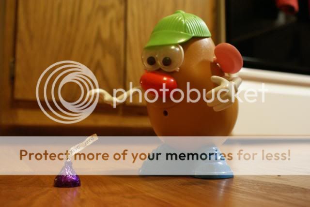
3- cute. seems out of focus some and the while balance seems off, the image seems a bit too yellow
4- as with 1, look into composition tools to help improve the image. its also out of focus and not too interesting
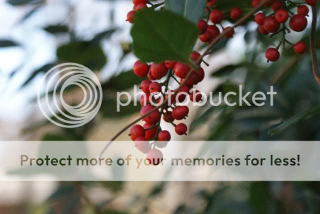
5- white balance issues as with 3. Nice composition, dont like whatever that is on the right. Be aware of everything in the frame, not just yous subject. Foreground, background, middle ground, sky, distracting images.
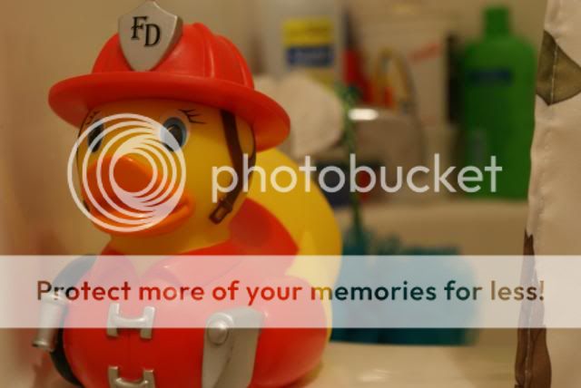
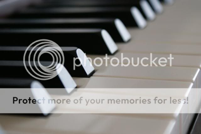
6- nice, standard, good focus. not liking the hot spots (very bright spots) on some of the black keys. Probably due to a window reflection?