My First...or, umm... Third Product Shot.

Bitter Jeweler

Been spending a lot of time on here!
Joined
Apr 27, 2009
Messages
12,983
Reaction score
4,991
Location
Cleveland, Ohio
Can others edit my Photos
Photos OK to edit
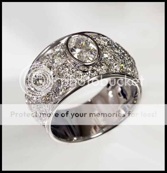
I tried something different, because in the past attempts, I couldn't get the background white. It always came out kinda gray. I don't know that I will alwalys want a funky background, but I think this came out pretty cool. It's also the whitest the white gold has looked, and the diamonds are brighter than I have achieved in the past. I paid a lot of attention to not get as many blown facets as I could.

Shot under flourescent lights, no flash this time. The substrate is Glass Block, with white paper underneath, and colored tissue paper at (under) the back edge.

4439972904_bc46ce40f9_o.jpg
 
Huh? Chunck?

Did you notice the abstract line composition in the background? :greenpbl:
 
Well... I like it and don't think I could have done much better but there are two things that bring questions to my mind....
#1 is the blurry area (the top part I circled)
#2 Is that you? (the bottom part I circled)
vesr9f.jpg
 
Yeah, I don't know what is reflecting in your upper circle. That one bothers me.
The other is not me.

I know I should be using a light tent or box, but it often makes curve detail come out very flat and undefined, I like how the surroundings reflect and really show the curves. There has to be a happy medium. I wonder if that funky blur is light reflected of the glass block?
 
I noticed the top spot circled also and wondered if it was plastic that may be used for packaging or something.....??
I did not notice the person...thought it was just glare lol.
And yes, a chunck....Am i the only one that sees it? I see that its just where some parts are out of focus, but that one spot just looks like its missing....

Yes yes yes i did notice the abstract background and think it works well! Its not boring like a plain background...and its not too much that it takes away from the subject. It gives it a nice feel...At least in my opinion.
 
To be quite honest I have NO clue. I'm just proud that my senses are keen enough to notice the imperfection.
 
Actually looking back at it again, i think the blur circled is a reflection of the reflection at the bottom...that does still look like a person....even though you say its not you...heehee
 
Could it just be a valley, between diamonds?
 
It could be reflection of the underneath the top diamond area. I dont know much about jewelry, but i do know the underneath is sometimes odd looking and i guess it could have caused that reflection...Especially with the rest of the abstract probably reflecting as well. But im pretty sure what ever is at the bottom is what is reflecting and causing the odd blur on the left.

Valley? What, the reflection or the missing chunck? lol
 
Hmmmm, I think the dark top wedge detracts from the colorful abstract background..

I'd actually like to see more spots of color in the texturing on the white gold :)

Great concept but I don't think it works for a straight product shot. As interesting as the background is the potential client should be attracted to the beauty of the piece.

Personally I'm not a fan of a shallow depth of field. The general public doesn't get it :)

Fluorescent lights as in CF bulbs ? 5500k ?

When you say previously the background was gray, was that the color of the paper backdrop or a result of light fall off ?

Please consider posting a picture of the set up in the future..

Cheers, Don
 
Hhahaha...this is handmade. I high polished the underside, so it's not that.


Valley=your missing chunk.

Don, I do this in my shop, which is small. The flourescent lights are typical 4 tube recessed ceiling.
I don't have the room, the storage, or the time to have a complex set up for "real" product photography.
I am working out what works the best FAST. I understand what you are saying about the color background detracting from the product. I was looking for variety. I am taking pictures of the custom jobs I make, for online and portfolio. Should they all just be done on white backgrounds?
 
Last edited:
Maybe......I dont know...It could be. I notice on the right side, there are "valley" areas around the edge between the diamonds so possible...Or it could just be the way it fades into the background right there around that edge...
Do you see it now?
 
Is it better just on white?

Again, on glass block with white paper under it, overhead (ceiling) flourescent tubes.

Domeagain.jpg
 
I like the first one better, I actually think the first background directs you more to the ring and makes it stand out, the second one is plain and boring.
 

Most reactions

Back
Top