What's new

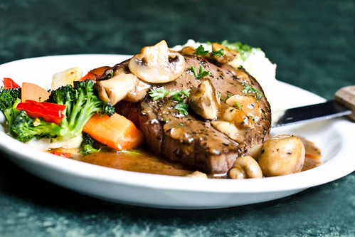
My first shot at food photography.

ghache

No longer a newbie, moving up!
Joined
Jan 25, 2010
Messages
3,570
Reaction score
296
Can others edit my Photos
Photos NOT OK to edit
Taken today for a friend. He will use the pictures for the his diner pub's webiste.

1.
5481123732_7f84a0b110_b.jpg


2.
5480516407_4d32202678_b.jpg


3.
5480512857_bc64c7f890_b.jpg


4.
5481126852_e14175787d_b.jpg


5.
5481121102_ae3114f0c9_b.jpg


6.
5481129024_0fbc840e19_b.jpg


7.
5480510695_391868ede2_b.jpg


What do you think?

all taken with a 50mm 1.8 + d7000
 
Last edited:
In general:

In most of them you clipped off the plate and even part of the food. The DOF seems a little shallow for the most part, causing part of the food to be OOF.

Specifics:

1. I think the wine & glass should be in focus.
3. Not digging the weird angle.
7. The wine label is a bit too bright, making the label hard to read.

Overall:

Other than the wine label in 7, I like the exposure and lighting. Although, a quick pass over them again the whites look a little blown out in a few of the other shots too, especially in the mashed potatoes.


I don't really shoot food, so maybe I'm all wrong, but I figured I'd tell you what would be more appealing to me. ;)
 
1 vivtard 285hv in a 24X24 softbox at camera right for the food shots. bottle of wine on the bar was only natural light
 
In general:

In most of them you clipped off the plate and even part of the food. The DOF seems a little shallow for the most part, causing part of the food to be OOF.

Specifics:

1. I think the wine & glass should be in focus.
3. Not digging the weird angle.
7. The wine label is a bit too bright, making the label hard to read.

Overall:

Other than the wine label in 7, I like the exposure and lighting. Although, a quick pass over them again the whites look a little blown out in a few of the other shots too, especially in the mashed potatoes.


I don't really shoot food, so maybe I'm all wrong, but I figured I'd tell you what would be more appealing to me. ;)

thanks for the reply. As for the wine bottle, it was more of a prop and addon to the picture since i though the plate only was kinda boring. DOF is really short and label is mostly un0readable in most of the shots except the last one where the bottle was the main subject.

I really wanted to have the food in focus and nothing else. In some of the pictures i almost regrets have the bottle there since its kinda big and might take away from the food itself. oh well, i think i didnt do bad for a first time
 
Hehe, vivitard.
lol_hitting.gif
 
VIVITURD
 
i love no.1, i love the way it was taken. is this like for a food magazine or something? most of food magazines or on site food photography are done this way, and in my opinion you did great. down fall of no.1 is the distracting bokeh ball with blades in the background. you should had cloned it but other than that, it's very well done. the 3rd photo can be corrected with photoshop :)
 
Im sorry if i edited one of the photo without asking, i don't know if your photos are ok to edit. anyway, here is my take on the 3rd photo.

5482528861_00288a547c.jpg


I find the dark space so small that it's a distraction. Still slightly falling off but not as much.
 
I really like your edit. thanks
 
i love no.1, i love the way it was taken. is this like for a food magazine or something? most of food magazines or on site food photography are done this way, and in my opinion you did great. down fall of no.1 is the distracting bokeh ball with blades in the background. you should had cloned it but other than that, it's very well done. the 3rd photo can be corrected with photoshop :)

Thanks, again, i will deffinetly clone the orange light from the background in number 1.
It was done for the pub's website.
 
#1 is the best of the bunch imo.. The only thing I dislike is in number 2.. for me the way the bottoms of the wine glass/bottle are a distraction from the plate. Same sort of thing in picture #4, the blurred out salad takes away from the pasta plate. I personally prefer the pictures that have just one main subject, but everyone has different taste.
 
I really like these pictures...I used to cook and love food and I don't think that b/c some pics don't show the whole plate means it looks bad....look in lots of food magizines..... I have seen lots of pics like these....I think you did a really good job :thumbup:
 
I think the lighting is great....and that food looks yuuuummmmy! The only thing that bugs me is that in every photo the plate is somewhat clipped off :scratch:
 
It made me hungry so i would suspect you did a good job everything looked fresh I suspect you didnt over handle anything and that really paid off.
 

Create an account or login to comment

You must be a member in order to leave a comment

Create account

Create an account on our community. It's easy!

Log in

Already have an account? Log in here.

Back
Top Bottom