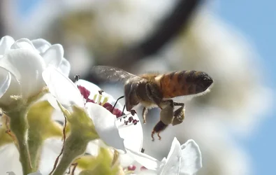
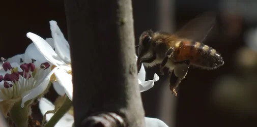
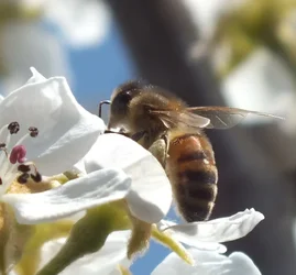
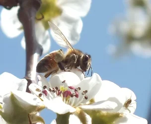
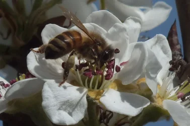
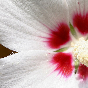
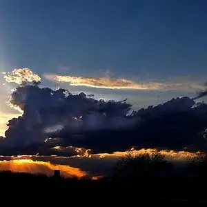
Out of the 5 pic set, I like 1 & 3 the best. Pic 1 has the Wasp in flight, which is a big plus. the picture looks slightly out of focus, and could use a slight crop to kill some of that dead space to the right. Pic 3 is well composed, and I like the close crop with almost no dead space. Pic 2 isn't well composed. You have that twig going right through the center of the picture dividing it into literally two pictures. Pic 4 almost made my list, but it needs a slight crop, just too much dead space. And pic 5 isn't composed well. The Wasp is is being blocked by the stamen, while it should have been the other way around.
All in all, for your 1st insect set, you did extremely well.