Very nice!
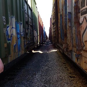
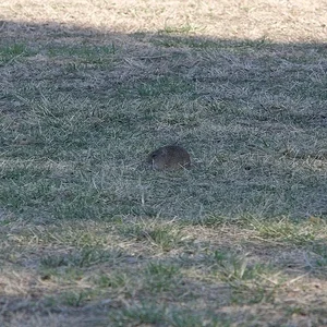
One suggestion I would make is to reconsider the composition of #1. The portrait orientation and/or 3:2 aspect just doesn't seem right somehow. The subject is horizontally oriented but yet you've got a portrait orientation with very little room on the sides and comparatively much more room at top and bottom. I would go with a more square aspect like 5:4, maybe even 1:1.