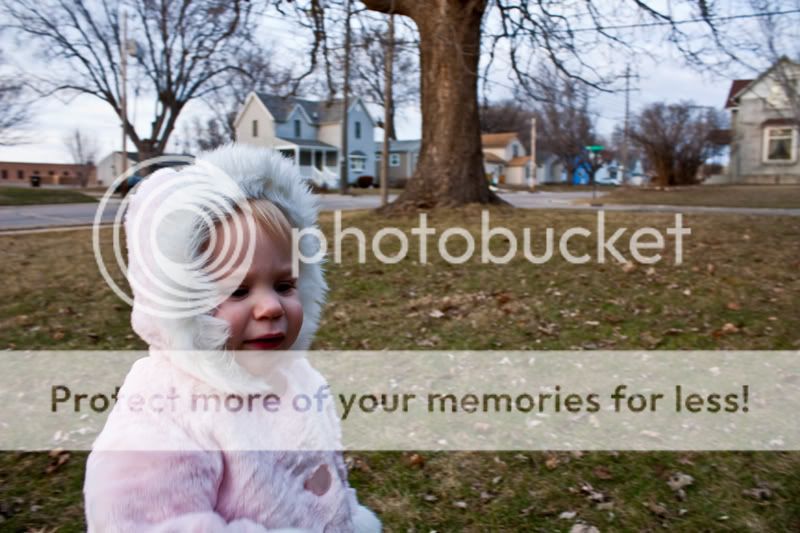
She's a cutie and her cute is darling! One thing I'd suggest is to compose this differently so you don't have her in the bottom corner there with so much negative space around her on top and the right of the picture. And maybe use a reflector to get some light in the shadows of her eyes there, otherwise the exposure looks good.

![[No title]](/data/xfmg/thumbnail/31/31704-42c2fcbcc4b6ba8c2c5ae54202cad6ec.jpg?1734160376)

![[No title]](/data/xfmg/thumbnail/41/41901-789e8104ff95e5862c8f07611e3c34c0.jpg?1734176261)


![[No title]](/data/xfmg/thumbnail/32/32930-09414fc020c2a60a456ff59a05c5ef8f.jpg?1734162706)


![[No title]](/data/xfmg/thumbnail/40/40412-73276feced223de99c761fc2cc279db5.jpg?1734174867)
