What's new

Need advice

XxTheZombiezxX

TPF Noob!
Joined
Aug 11, 2012
Messages
53
Reaction score
1
Location
Daytona Beach, Florida
Can others edit my Photos
Photos OK to edit
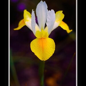
So, I took advice from last time, and also tried some stuff with Lightroom other then use standard presets given to me by Adobe upon purchase of Lightroom 4. And this is what I came up with. I feel as if one really sticks out the best. But the rest of them, I'm not sure, and really could use some advice on.

|Model:NIKON D3100 | Shutter Speed:1/2500 second | Aperture:F/4.0 | Focal Length:24 mm | ISO Speed:400|

Flowers by Wesley Graham, on Flickr
I really feel as if this is by far the best I've done yet.

|Model:NIKON D3100 | Shutter Speed:1/125 second | Aperture:F/5.3 | Focal Length:48 mm | ISO Speed:400|

Flowers by Wesley Graham, on Flickr

|Model:NIKON D3100 | Shutter Speed:1/100 second | Aperture:F/5.0 | Focal Length:26 mm | ISO Speed:400|

The Infamous Tea Pot by Wesley Graham, on Flickr

|Model:NIKON D3100 | Shutter Speed:1/6 second | Aperture:F/5.0 | Focal Length:35 mm | ISO Speed:800|

Me by Wesley Graham, on Flickr

|Model:NIKON D3100 | Shutter Speed:1/15 second | Aperture:F/4.5 | Focal Length:30 mm | ISO Speed:800|

Happy Birthday by Wesley Graham, on Flickr
 
The 2nd one is not appealing , but the 1st one is better. The Happy Birthday shot is well a Happy birthday shot LOL. Self portrait in mirrors can work, the open door is a distraction. The tat could be used to your advantage here. I REALLY appreciate the shooting data. Not sure what advice you received about post processing so not sure what to add there. Good luck.
 
Yeah, I just had a chat on Froknowsphotos.com's forum about these. The only 2 I like myself is the 1st and 3rd. The rest I wasn't a fan of myself, but I posted them anyways to see where I can do better next time.
 
You NEED a calibrated monitor. Those are all mostly black dark and heavily orange.
Using presets will get you nowhere. You need to use the sliders in there and learn what they control. A preset won't work for every image the same and you will never have any consistency in your images.
 
You NEED a calibrated monitor. Those are all mostly black dark and heavily orange.
Using presets will get you nowhere. You need to use the sliders in there and learn what they control. A preset won't work for every image the same and you will never have any consistency in your images.

Good advise which I need to utilize as well...
 
#1 has some balance
#2 the colors are snappier, but you've lost the balance
#3 might have been better with a different angle on the background
#4 is not much but for the sepia tone
#5 not getting much from that one
 
Oh, I didn't use presets. I was playing with the sliders. I tried a few presets, and I just did not like them at all.
 
You aren't seeing what we are seeing. These images are mostly extremely dark. There is solid black behind the flowers in the first and it's encroaching onto the flower itself. The second is so over saturated and contrasty that much of the flowers themselves are black. The second the area around where the kettle is sitting is nearly black and that black blob to the left is pulling you right there. The greens are nice and bright where the sun is hitting it.
The self portrait you have no eye on our right side, it's a black blob, your hand has only definition where the light is hitting the fingers and wrist. next to the camera it's black, the camera is mostly a black area except for highlights. Your hair is a solid black blob. Your left eyeball is black with a great highlight, but no definition otherwise. THe contrast is beyond heavy.
The balloon is seriously underexposed and the light is the only thing close to proper exposure.
You can't possibly be seeing what we are seeing. Monitors straight out of the box and uncalibrated are set up for internet and gaming. They are WAYYYY brighter than a monitor set up for photography and you will see things a whole lot brighter than they really are. They also tend to err to the side of being very cool, so you will think things look blue, when in fact they are rather warm in color. I suggest you order these images as prints exactly the way they are so you can see what they REALLY look like.
 
When you have more than one or two images, I would suggest that you number your images, it makes it a lot easier for a reviewer to refer to them and there is no confusion about which of your images is being discussed - Thanks. Having said that, I would echo the comments about using presets. They will not work the same for every image and the more things that a preset modifies, the less useful it is in applying it to a number of different images. Your images all look like they are underexposed (what metering were you using?) and the second one looks like it is either out of focus (OOF) or badly oversharpened - a bit of both maybe. I would agree with MLeek that you need a calibrated monitor. Trying to do image processing without a calibrated monitor is like trying to drive a car without a speedometer - you never know what you are doing - really. HTH.

WesternGuy
 
#1: This is a good composition; i feel a green colorcast
#2: This much light is not good for floral-graphs
#3: Here a vertical composition without the bright grass behind would have been better
#4: I liked it; the dark shady eyes add an element of evil, which worked well; but vignetting is not good
#5: This is not the way to wish "Happy Birth Day"...with a turned away face ;)

All The Best

Regards :D
 
I know what your seeing, because I see it too. I'm not using some cheapo monitor. What my problem is... I'm using a 8 year old graphics card, but I do get the idea. I know the images are dark, and that's just because im having a hard time getting a hang of lightroom. I do see all the darkness in the pictures. I'm sitting here now trying to make these pictures less dark.
 
It has nothing to do with a CHEAP monitor. It is CALIBRATION. EVERY monitor needs to be calibrated, not just cheap ones. You can't edit in any way without doing that step. You don't see what you are doing if your monitor is not calibrated for output. EVERY monitor comes set up bright. It's the way they work.
PLEASE have these printed through mpix or similar to see what they look like in reality compared to your monitor. And not at wal mart. Although if you have a costco they do a fairly decent job.

Balloon is underexposed still.
the flowers are slightly under
The teapot is much better
The self portrait is out of focus with motion blur. I can see definition in the eye on our left, subject's right and I can see an eye on the right side now. Hands have definiton all of the way through them.
Don't use the first panel so much. Don't use the contrast slider.
Try using the second panel-parametric and point curve and move those about.
 
-.- I have calibrated it though. But, since you believe otherwise. a second panel what? I see the exremely dark areas in these photos. Its not a monitor issue. It's just me messing around with light room not knowing what im doing.
 
The second panel down in LR will look like a grid with a bunch of numbers in it. Try playing with those. THe first panel will have Color Temp, Tint, Exposure, highlights, etc. The second panel will have a tab at the top of it that says point or parametric curve. That will give you the most control over the image. You can also drop a point (click) on any area in that graph and move the curve around. Once you get used to those sliders and how to use them the only thing you MAY have to touch will be the white balance and perhaps a little on the exposure one way or another in the first panel.
 

Create an account or login to comment

You must be a member in order to leave a comment

Create account

Create an account on our community. It's easy!

Log in

Already have an account? Log in here.

Back
Top Bottom