need serious critique of this photo

Dew

TPF Noob!
Joined
Jun 27, 2003
Messages
1,688
Reaction score
0
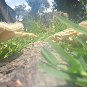
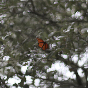
i need a serious critique of this photo ... be nit-picky .. look at the details ... tell me what u dont like about it... what u like about it .. what u think about when u look at it... dont hold back people, hold no punches, rip it to shreds ... im ready for the next level... i need to know how much i really suck :lol:

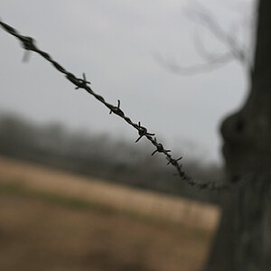
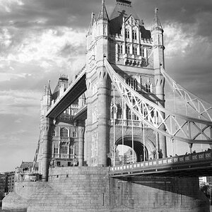
also, can you rate this photo with a number from 1-5 .. "5" being the highest and "1" stinks!!! .. thanks in advance


kwame_bench.jpg
 
Hi Dew!

Get the little poll thingy going - they are heaps of fun. No suck at all, my first reaction was "I Like!"

I rate this 4.59997223424278978824242342141512421113141427921342/5 out of five:

This is just just from my first reaction:
1. Love the subject, great facial expression, usual your people pics look very natural and unposed. Thats a gift :)
2. Like the park bench/sitting them. The Bench has nice detail
3. Background is just a bit busy (I am being really nit picky because its really but not too bad) what was your fstop on this?

All in all :thumbsup:

Whoever that is must be really happy with that. Although he has the look on his face "When we will date get here??" :D
 
Nice one. I like the diagonal line of his leg opposed to the horizontal lines of the bench.
I wonder what it would have looked like had his head been in the bright part where there would not have been any houses in his immediate background - do I express myself? Do you know where? Just to his right (as it is now)... just wondering.
To me he looks posed, though.
 
Hey Dew :)

I Like this shot. Just a little washout in the sky, but the placement of his head in front of the building helps. If he was infront of the sky it wouldn't of worked. Focus and contrast are nice. Composition and framing work well. Only things that jump out at me are the socks. The big thick wooly socks don't seem to go with the suit. Maybe it's bloody cold there during the shot, i don't know (i do know it's nice and warm here :) ). Apart from that you've done a great job with this given the position of the seat ( in that i mean the washed out sky).
You've got some good stuff happening, and heaps of talent. Doxx has taught you well grasshopper. I think it's time you went out into the world and unleashed your skill upon the paying community!!

4.765 OUT OF 5
 
That blurry building is somewhat distracting. I would crop out the building on the right and have it stand portrait instead of landscape.
 
As I've said before, I think that a viewing of the actual photo would make for a better critique, but I'll give it a shot.

There is something up with the tonal range. At first I was going to say low contrast, but I seem to see solid black and pretty close to white (although, they could be brighter). When you look at the pic from chest level down, the tones seem snappy. From chest level up, the suit and face are starting to get washed out. Maybe this could be helped by burning the top section, or some tricky work in curves (just learning those myself).

I would like to see the background more out of focus. I'm not seeing enough seperation between subject and background. The tone of the building behind him matches the tone of his face too closely.

I love the composition, and I like the buildings in the background.

I really liked that other BW you posted of the guy sitting on the street. My only gripe would be the tonal range in that one too; it seemed low contrast for my taste, just a little murky.

I don't know what film you were using for this shot. I think that C41 BW tends to run low contrast. If your lab offers a choice in BW paper grades (probably not likely), request a higher contrast when getting prints from C41 BW.

I'll give the composition a 4, and the printing a 2 (meaning that I think that if this was hand printed it could be made to shine).
 
luckydog said:
Hey Dew :)

..... Doxx has taught you well grasshopper. ....

4.765 OUT OF 5

OMG!!! how did u know he called me that? :shock:

anywho ... you're not being brutal enough people!!! :lol:

this photo i shot of a family friend testing my film camera (i also shot it in digital) ... there was another friend involved in this shoot as well .. so i guess he was waiting for someone (good job with guessing that one) ... i shot it with Ilford C-41 (i think this film is flat in contrast, i will not use it again ... EVER!

this photo, im very unsure about .. i dont know what to think of it ... i need u guys opinion :)

keep the critiques coming... :D

oh, and the sun was coming from behind him .. i know ..its a "no-no" ... but i wanted him on the bench ... on my digital camera, i used a fill-in flash
 
Here goes the Drill Sgt. (blunt and honest) as I am :roll:

- his face lost detail, flat looking
- not enough shadow detail
- dodge the windows on the right a bit
- I like the buildings BUT the tone of his face is too similar to the building on the left.
- Nice structure in the bench
- Nice detail in the whites (at least in his shirt, sky is blown)
- shitty socks

note to self: don't touch that roll of C41
 
thanks for your opinion Drill Sgt Härtel and others :lol:

his socks look a little strange .. however, i wouldnt request he change it .. here's why ...

the socks arent the best ideal for the tux, but i think thats the beauty of it, he appartently is not use to wearing a tux and i think the socks reflect his personality :lol:

im gonna work on the pic to see if it can be saved, if not ... can u say TRASH? :roll:
 
You want brutal? I'll give you brutal. Really, I'm going to give you my honest opinion since I'm clearly in love with all of your other stuff.

1. Least favorite of your photos
2. hate the bottom crop. Too close to running with the bottom of the bench.
3. Shirt is blown out. I'd like to be able to see some of the detail like the cufflinks and buttons.
4. The image sweeps me from left to right...off the page.

I'll give it a 3 at best...only because it has to compare to your other stuff.
 
thanks for all your comments ... im on a mission right now .. i need to fine tune my skills... i have a goal by this time next yr ... i have a personal project right now that i've set in motion... its gonna be a series .. i'll give ya more details when the project is complete .. in about a month or so :wink:
 
It's a good photo and there are lots of good points but since you are looking for criticizm...

I agree with most of what the others have said, the background is distracting, the crop bothers me...too close for the bench and maybe too far for the head/face. Contrast could be better.

I find that the subject does not look all that natural. He looks posed or as if he is posing. He does look comfortable, which is good but what is he looking at? By looking out of the frame it's like he's saying "There is something more interesting over there..." He's looking up...which makes me think that he's not looking at anything...just posing.

Still a good photo by my standards...but I'm sure you can do better :wink:
 
Ok Dew...here ya go :twisted:

First off....getting myself in harda** mode for you :shock:

1. needs more contrast, looks like you are afraid of contrast a bit. His skin tone dosn't seem to be what it would look like in reality. More contrast would help you with background too (it would lighten up some of the buildings).

2. He is a little too far to the left of the frame. Moving him over a little would place his head on the third line and draw focus to his face.

3. Bring him down a little too. If you placed his head on the intersecting third lines it would make a stronger compisition. And it may deel with the problem of having a bilding siloweting his head

4. The image looks 2 dimentional. If you you were a little angled from him it would give some depth. As it is, it looks like his intire body is on the same plain. This could help with the problem of looking up his croch too.

5. The croping on the bottom is a tuff one. If you croped it lower then cutting off his leg would look bad. And if you leave it like it is then we have distrating lines from the bench. I would have went with pulling back to show his hole body in this case.

6. The lines of his shoulders and the line of his sight pulls my focus out of the frame. You could kill several birds with one stone by moving a little to your right and pulling back for a full body shot. This would have brought his line of sight closer to the veiwer and given more depth of his body and delt with that hole "looking at the croch" thing and the lines of the bench would bring focus to the subject rather than away and delt with that building behind his head and I don't think I could make a better run-on sentence. :lol:

Hard*ss mode done

I like the look on his face, it can give lots of diferant posibilities for emotion.

I like his relaxed comfterble maner. I think you did a good job at showing personality in your subject. That can be harder to do than everything I wrote above...Good job Dew

I like the texture of his suit and the bench. You have a nice distinction in textures between suject, bench, and backgound.

I am very glad to see the camera angle lower like that. Too high of a camra angle is a comon mistake. For such a stronge subject, you wouldn't want to be looking down on him. Mid-chest level is perfect.

Hope this helps you
 
3.5.
dark socks would boosted to a ~4.

good model. its a nice effort.
 

Most reactions

New Topics

Back
Top