cigrainger
TPF Noob!
- Joined
- Feb 2, 2007
- Messages
- 480
- Reaction score
- 1
- Website
- www.flickr.com
- Can others edit my Photos
- Photos NOT OK to edit
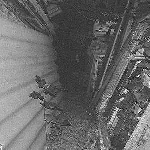
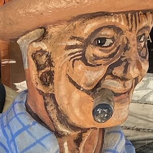
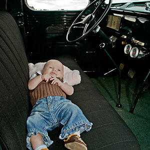
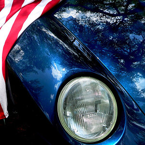
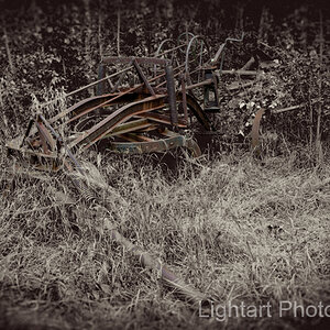
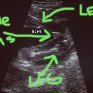
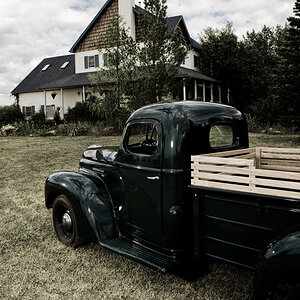
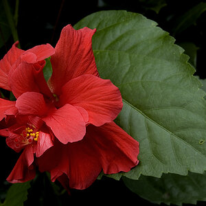
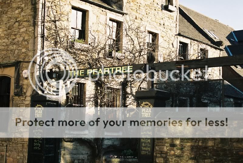
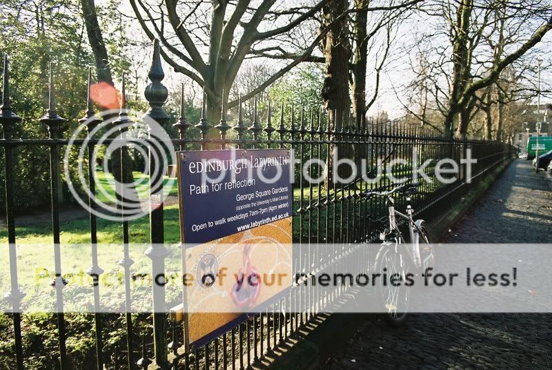
These are from my first two rolls with an SLR ever. Let me know what you think!
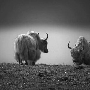
1.

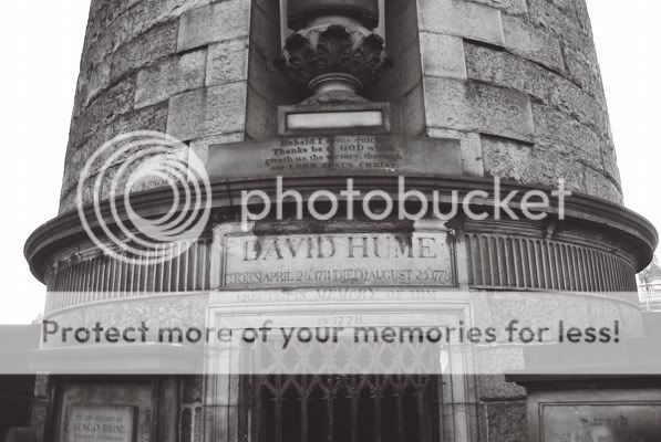
2.
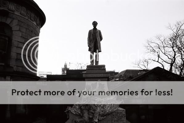
3.
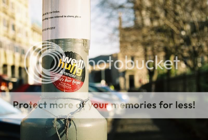
4.

5.

6.

7.
8.
9.
1.
2.
3.
4.
5.
6.
7.
8.
9.

") - or actively take the scissors to your print, for that matter).
- or actively take the scissors to your print, for that matter).