Welcome to the forum.
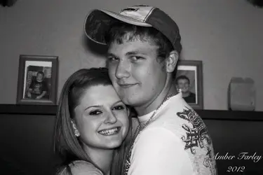
The first one is in landscape/horizontal orientation...which doesn't really suit the subjects, leaving a lot of dead space on either side of them. In the second photo, you turned the camera (or just cropped differently), which is a good start, but in this one, you left too much space around and above them. Crop this one is close, and it would be better.
The background isn't great, it's not terrible, but that horizontal line is running right through her head. Remember that photos are two dimensional. So when you're looking at it, you can easily differentiate the foreground from the background...but in a photo, it's harder for the viewer to do that...so you should compose your photo to avoid things like that line going though people's heads etc.
It looks like you used on-camera flash. That is better than having to use a long shutter speed and thus getting a blurry image, but in terms of good looking light...on-camera flash is at the bottom of the barrel. Firstly, because it contrasts from his white shirt, it really stands out that her arm is 'broken' by his arm crossing in front of it. This tends to make her arm look unnaturally long. Also, because of the angle and how she's squeezing him, her elbow doesn't look good (few do) and her forearm is bulging.
Another thing to work on, would be how you pose your subjects. I like the close up view in the first one, it creates a nice intimate photo. In the second one, their arms around each other like that, don't look great. Especially her arm.
Also, be aware how how a person's neck looks when they turn their head. Because he has to turn his head almost 90 degrees, there is a big crease of skin on his neck. Best to avoid that when you can.


![[No title]](/data/xfmg/thumbnail/39/39225-99d579cd498f8f152a288d7e8e7ad2a4.jpg?1734173134)


![[No title]](/data/xfmg/thumbnail/39/39224-aa3271aa220fe57f37caf898b6984846.jpg?1734173134)

