New Orleans Alley

Tuffythepug

No longer a newbie, moving up!
Joined
Jul 17, 2012
Messages
851
Reaction score
278
Location
northern California
Can others edit my Photos
Photos OK to edit
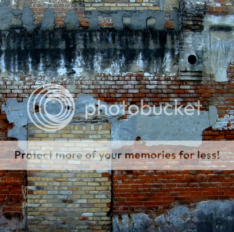
Spotted this brick wall with lots of texture and color while taking an alley shortcut in New Orleans. I don't particularly like the black circle in the upper right corner though. It's the end of a pipe of some type. I didn't want to lose that much of the wall by cropping it out though. What do you guys think ?

NewOrleansalley.jpg
 
The circle is conflicting with the left empty space. I think the circle is fine, but the left side consumes too much of the composition. You are also slightly under exposed and the white balance is far too cool. Add some contrast and selectively increase saturation, and I think the image has some real potential:

$NewOrleansalley.jpg
 
Here is the shot with your crop and bump to the contrast and saturation. I didn't want to go too far with it quite yet. How's this ?

NewOrleansalleymod1.jpg
 
It's better. I don't like the blue in the white areas.
 
Well...it's killing me to see all these awesome elements arranged in a way that I am not sure about! I hope there is a sharper version of this, first of all.. As hinted at by the others, the placement of the door is not exactly where I would like. I wish it was a bit taller or shorter, either one.

Are you kidding me...keep the pipe!! The perfect circle adds to this interesting composition. I would work on the color saturation, contrast, sharpness, and exposure in some parts. My $0.02
 
It's true. There's almost an embarrassing amount of potential here that is just out of my grasp..... for the moment.. When I saw this wall I knew I had to shoot it. I couldn't even guess how many different layers of oddly-matched materials are assembled in that wall. the area that was obviously a door is, in fact, not normal entry door proportions. That's why it looks too short and fat. I'm going back to the original and try some different crops and settings for saturation and contrast. the comments have been helpful and, I think, very valid takes on this image.
 
I've looked at this a couple of times and now I think I have my thoughts sorted out (I guess we'll see about that). First, there is a lot of barrel distortion that is detrimental to this IMO - it needs to have some straight lines. That should be easy to correct in software. Second, I agree with unpopular about the blue cast, which appears also in the lighter bricks and the bare concrete patches. A white balance or color balance adjustment should take care of this. Finally, my two cents about a crop is to crop the left almost to the middle of the lighter bricks (leave the hole above the center of the light bricks just off the left edge) and the bottom just enough to eliminate the bare concrete in the lower right. There are probably many crops that would work, but this one emphasizes the elements that catch my eye.
 
Too tight, IMO. Way over sharpened, too contrasty.
 

Most reactions

Back
Top