All good uses of the "rule" of thirds. Lets think go it as guideline though since some images will just feel better if you ignore the guideline of thirds.
Basically I'm saying is as with almost all of the traditional "rules", learn them but don't be constrained by them.
I'm confused, are we talking composition or processing? As mentioned, the rule is a theory and makes no difference of your not offering something visually. I could poop on a piece of paper, probably will miss the thirds area, crop it, and it's still poop on a piece of paper.
I posted the first three because I was practicing the rule of thirds. And then I was looking at the second photo and thought the color could be brought out a bit more and took the raw image back into the processing software and adjusted it a bit more. But looking at the two side by side I thought maybe I took it too far. Only thing is I don't have much experience with this. And I though tthat since I posted the image in this thread originally this would be a good place to post the adjusted one since they would be easy to compare. At least that's my thought process.
Your second effort on the (rototiller blade?) rusted metal looks a bit better, abd I do noy think it went too far. it's good to experiment, and let the image come out, maybe even over weeks. Don't be too sure about the "final form" of an image un you really give it a chance to come to you, exactly how much work needs to be done to the image.
Looks fine to me mate. I actually prefer the contrast between the rust and darks in the end shot.
The shot with the green barn in it, I'd have placed on the third line on the right, because of the way it's facing. Things tend to look a bit better when they have a bit of space. In your current shot there's not much in the right third, and if you placed the barn on the right third it would remove the dead space and the slanted fenceline could provide a nice leading line into the shot
I love the rust shot, especially the second one you processed.
In the first image, my attention is more drawn by the brighter knot (or whatever it is called in english ) in the top center, because of the contrast. But nothing some processing can't fix. The barn I would put on the right, as said by Weepete as well. Though I would also play a bit with it, I can imagine a shot with the barn slighty more to the left, with the window being just left of the one third line, could also be interesting. Maybe play a bit with the focussing to get the fence more out of focus.
I posted the first three because I was practicing the rule of thirds. And then I was looking at the second photo and thought the color could be brought out a bit more and took the raw image back into the processing software and adjusted it a bit more. But looking at the two side by side I thought maybe I took it too far. Only thing is I don't have much experience with this. And I though tthat since I posted the image in this thread originally this would be a good place to post the adjusted one since they would be easy to compare. At least that's my thought process.
You did well for the project. It's good your thinking about it because it makes you consider the frame. Thinking prior to shooting is a good thing. Remember, the rule is not about just the intersections but also the lines. Try groups of three.

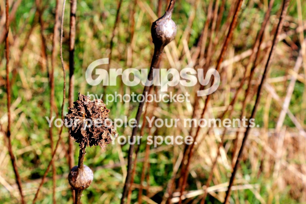


 ) in the top center, because of the contrast. But nothing some processing can't fix. The barn I would put on the right, as said by Weepete as well. Though I would also play a bit with it, I can imagine a shot with the barn slighty more to the left, with the window being just left of the one third line, could also be interesting. Maybe play a bit with the focussing to get the fence more out of focus.


![[No title]](/data/xfmg/thumbnail/33/33494-b043d63ade80615498faca324203747a.jpg?1734163606)

![[No title]](/data/xfmg/thumbnail/34/34746-f8e4b50f9d9b0de43c95af3d2caf956b.jpg?1734165779)
![[No title]](/data/xfmg/thumbnail/33/33493-f055dbbe7f00f271d3959dd3a6482165.jpg?1734163605)