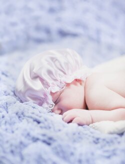
The first things I notice are 1) All three photos are over exposed. 2) In the second photo, the baby's face isn't visible and she looks a bit uncomfortable. 3) I prefer not to see the edges of the blankets/fabrics used in these type photos, except in very deliberate circumstances. Keep at it. Just posted some from my second newborn session. Feel free to let me know what I need to work on as well. http://www.thephotoforum.com/forum/people-photography/333485-superbaby-newborn-photos-comic-fan.html
you need to learn how to meter with the meter in your camera... an external light meter won't help unless you learn how to.
My advice would be stop using PATTERN metering mode in situations where you need to decide what to meter, not the camera.Try Single Point metering (Spot) and learn to use it. Also learn to bracket or at least use EC.
Yeah, they're overexposed, but you can get away with a lot of that in this sort of high key baby-in-the-mist photos.
The main thing here to MY eye is too much contrast. You can just raise the black point if you want, but there are more subtle ways to do this. Add a layer of white, masked with a grayscale copy of the underlying picture, set blend mode to "lighten only" and transparency to taste. There's probably an easier way to do this, but I dunno what it is.
Anyways. This is a bit of a crop, clean up a couple skin blemishes, decrease contrast as above, unsaturate reds and magentas a little to give the kid prettier skin (well, to my eye, tastes vary), and a bit of diffusion glow effect which is basically the lightening effect described above, with a bit of a blur applied to the mask. Rough job of cloning out that bit of junk upper left.
ETA: I kinda hate myself for doing these kinds of things to baby pictures, but man, those tropes sure are cute and people sure do love 'em, and I kind of get why. I kind of love 'em myself. It interferes with my self-image as a gritty artistic type, but what the heck. I love McDonald's too.